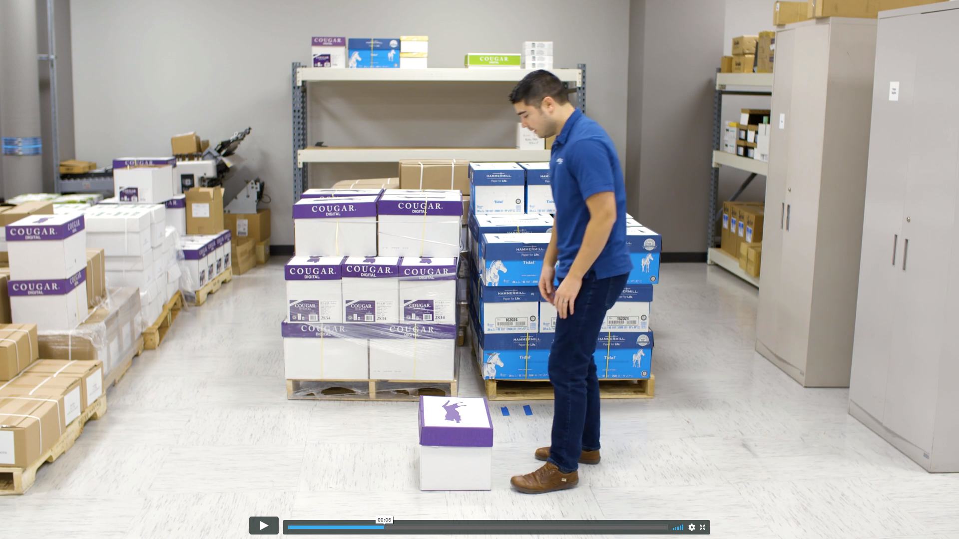
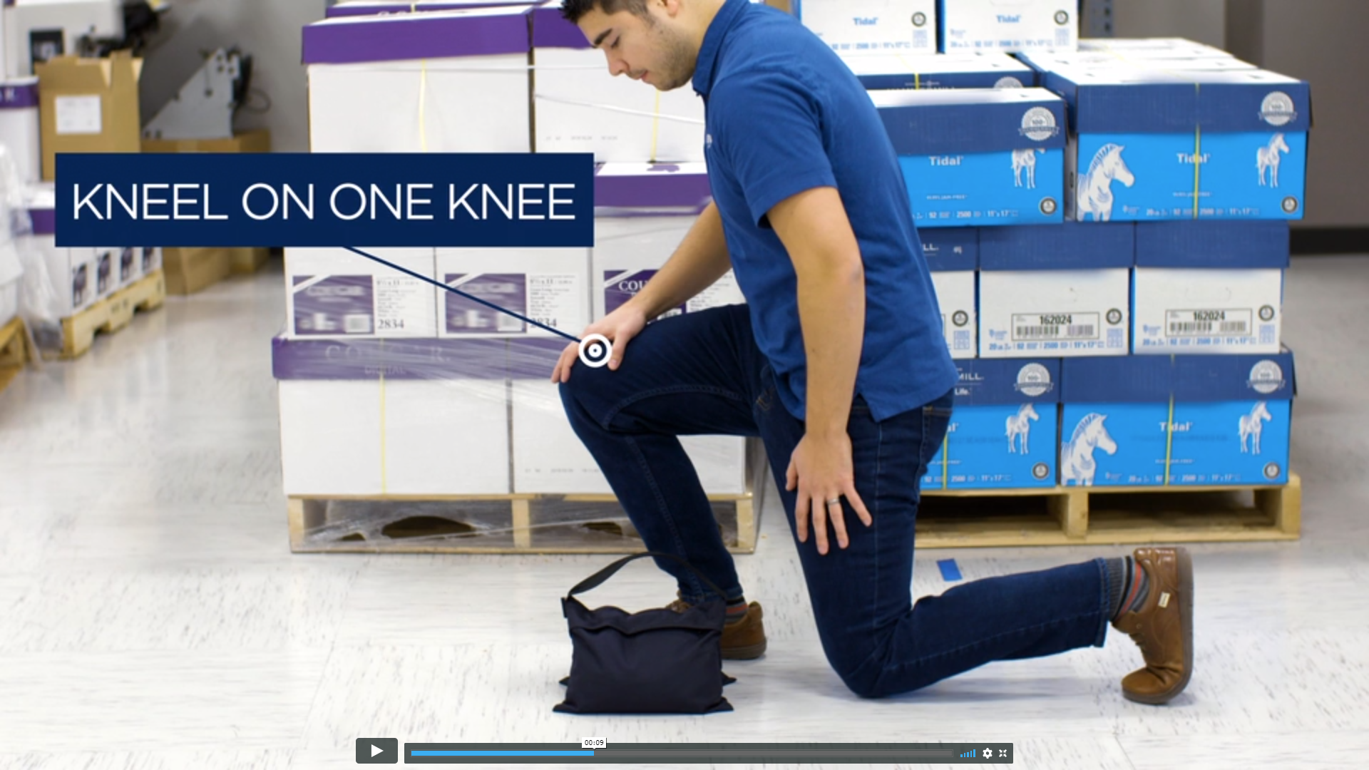
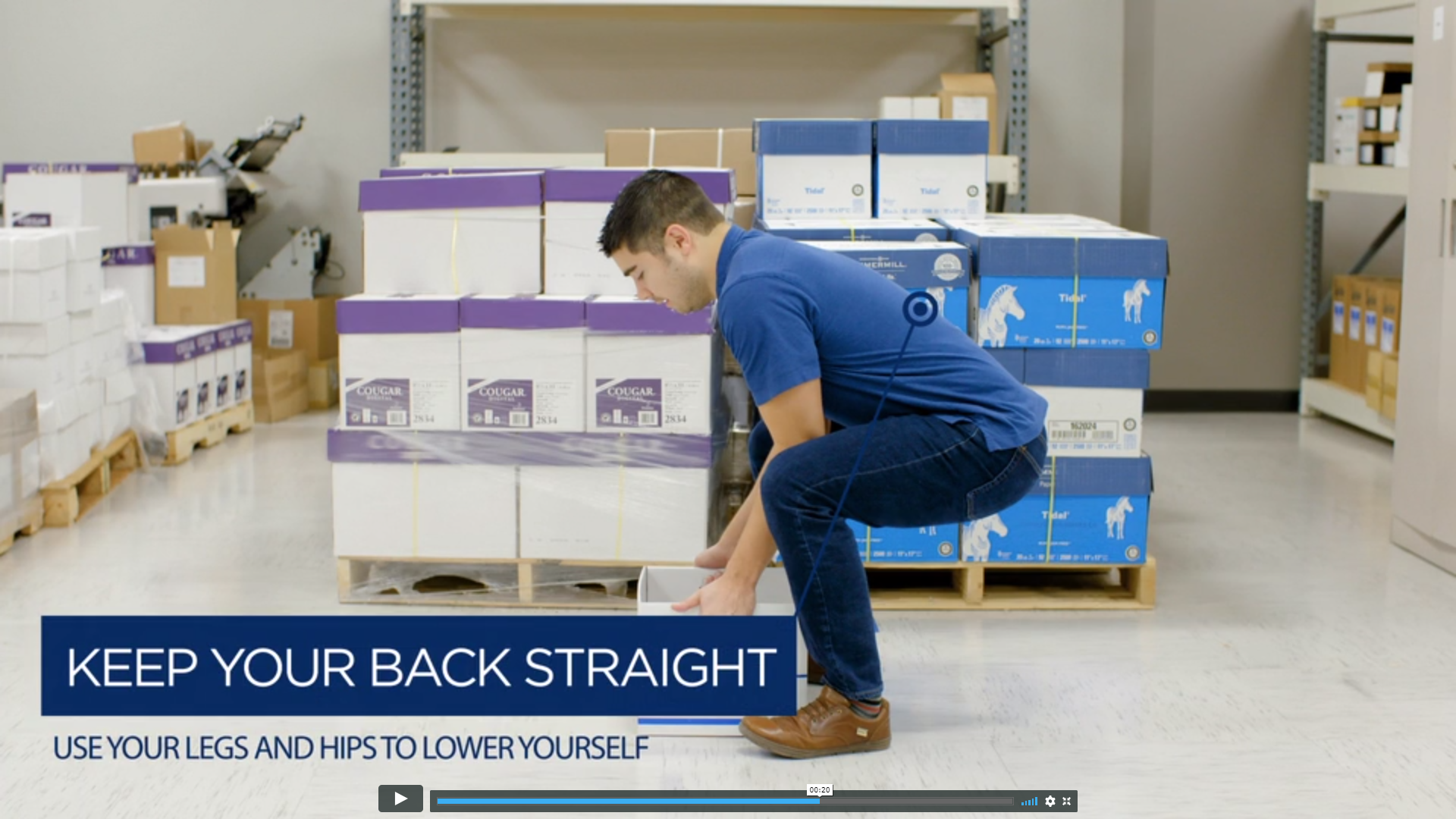
Never lift anything 😉 but if you do here's how! Click the button below and scroll down to see me lift 5 different ways in my first acting gig. My coworker Phil shot and edited these videos in our on-site print shop.
Viewing entries in
branding
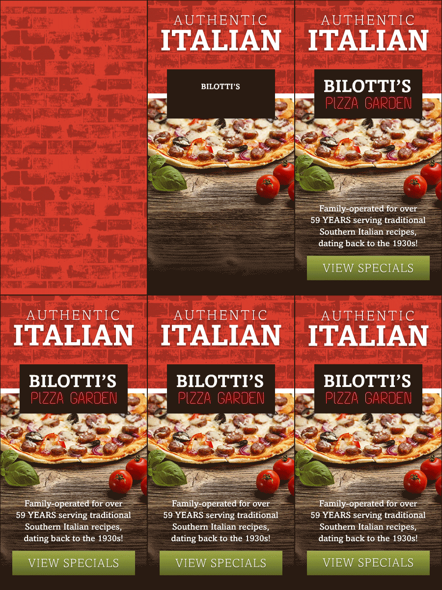
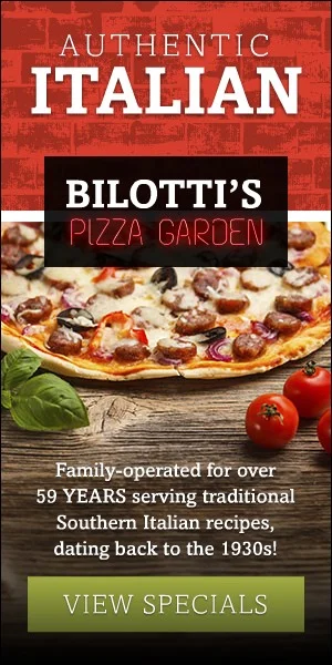
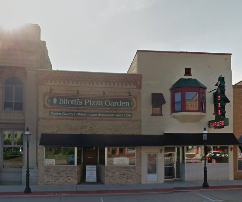
This is a campaign that I worked on with the GIADC Creative Campaign team. The creative was developed by me and Hayley Peterson and led by Brian Tallman. I designed the digital/animated ads and Hayley designed the print ads. I also designed the logo because the client didn't have a consistent one. I based it off the look of their building and used neon letters because the locals know them by their neon sign.

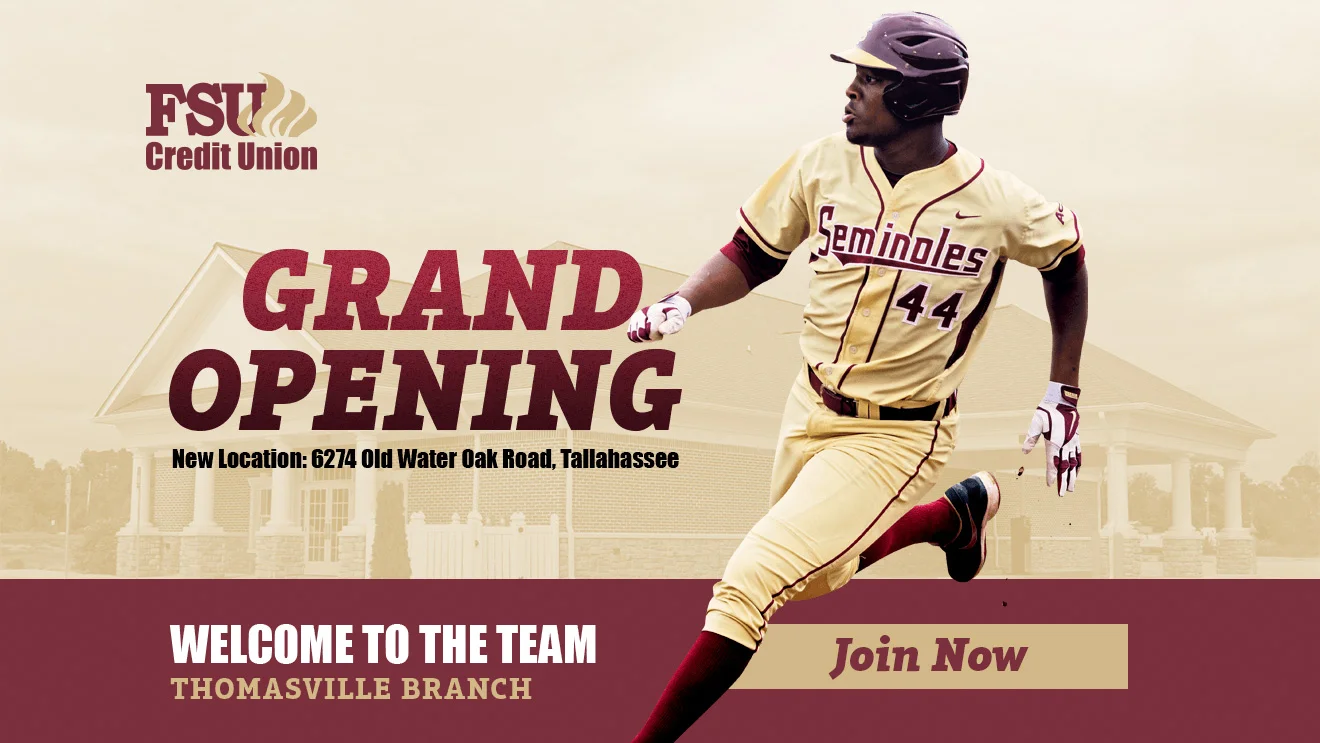
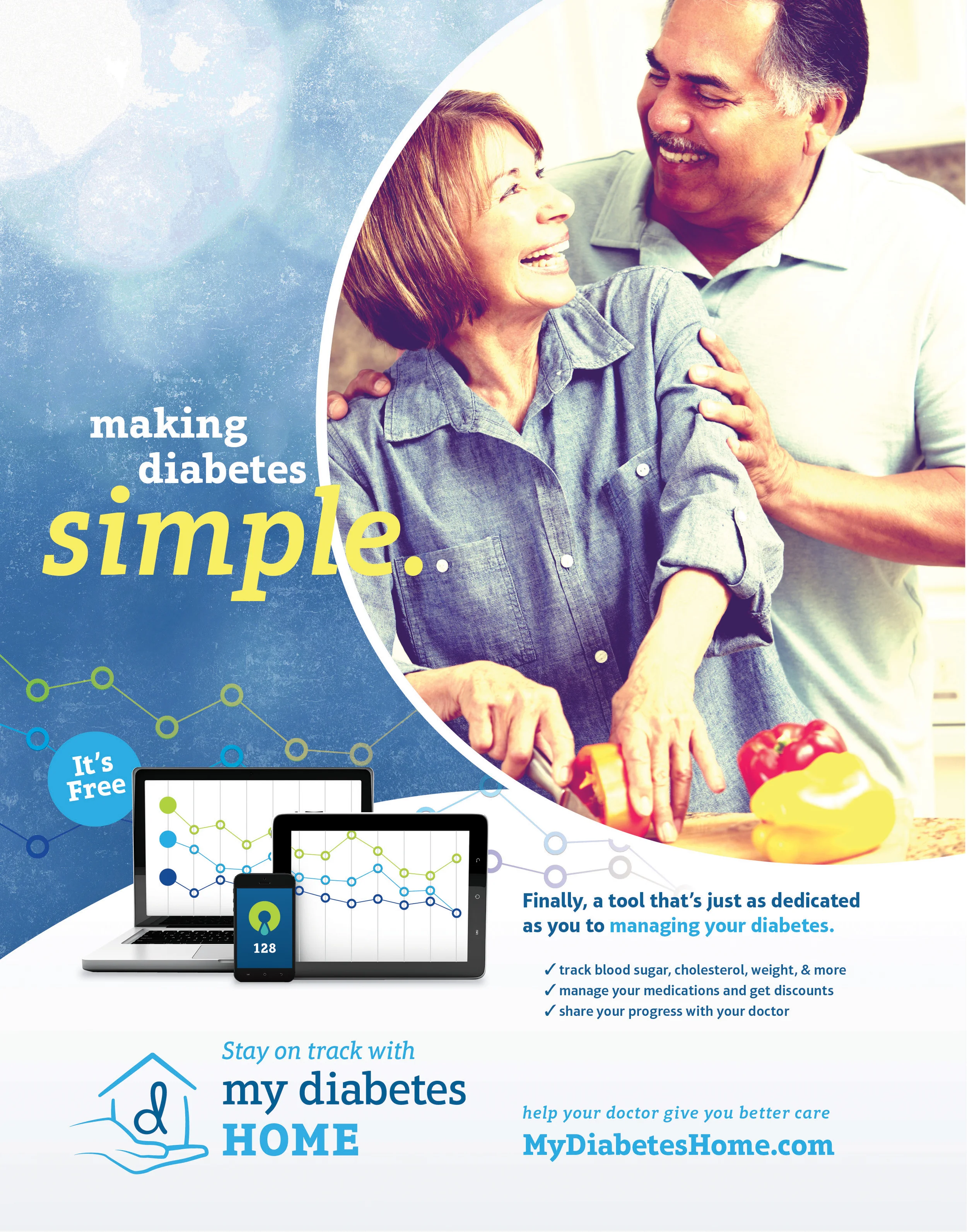
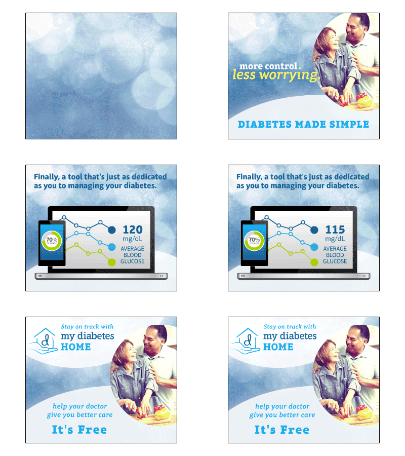
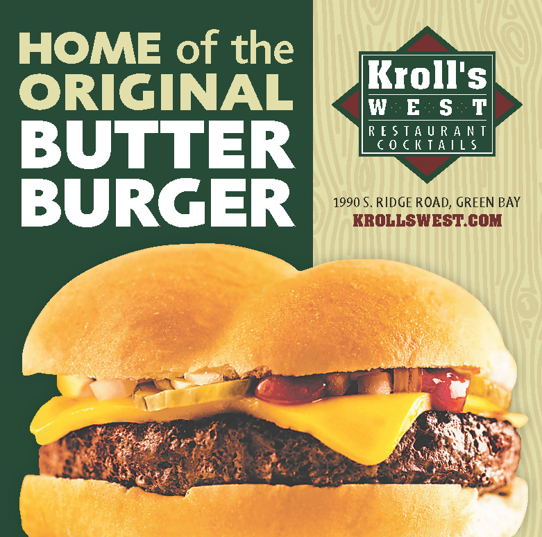
This is a campaign that I worked on with the GIADC Creative Campaign team. The creative was developed by me and Christine Thompson and led by Brian Tallman. I designed the digital/animated ads and Christine designed the print ads.
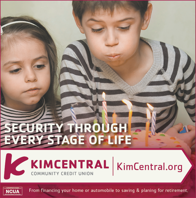
This is a campaign that I worked on with the GIADC Creative Campaign team. The creative was developed by me and Krista Kent and led by Brian Tallman. I created the animated ads and Krista made the print ads.
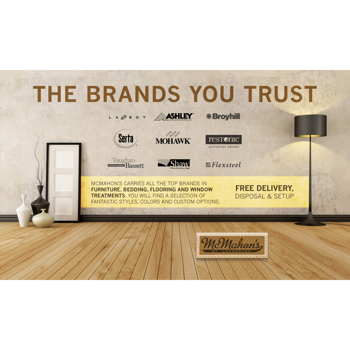
This is a campaign that I worked on with the GIADC Creative Campaign team. The creative was developed by me and Jon Kytola and led by Brian Tallman. I created the animated ads and Jon made the print ads. We took some of their existing branding elements and made it more iconic and eye-catching.
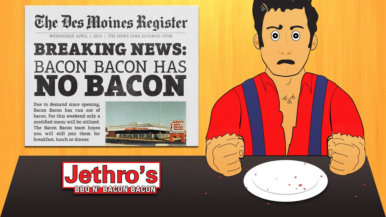
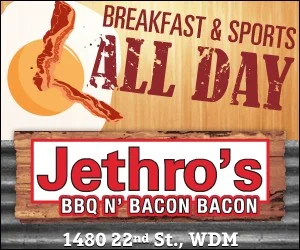
This ad campaign was originally proposed for Jethro's BBQ N' BACON BACON's grand opening but that was delayed and we ended up reusing the art for an April Fool's joke. It was created with the GIADC Creative Campaign team by me, Hayley Anderson and led by Brian Tallman. I designed the animated digital ads in Adobe Flash and animated HTML5 ads in Adobe Edge. I also illustrated the new front facing Jethro character.
This is a campaign that I worked on with the GIADC Creative Campaign team. The creative was developed by me and Kris Ahrens and led by Brian Tallman. I created the animated ads above and Kris made the print ads below. We had a lot of fun with making the color palette and writing some punny copy.
This is a campaign that I worked on with the GIADC Creative Campaign team. The creative was developed by me and Ben Patin and led by Brian Tallman. I designed the digital/animated ads and Ben designed the print ads. I also designed the logo.
This is a campaign that I worked on with the GIADC Creative Campaign team. The creative was developed by me and Jon Kytola and led by Brian Tallman. I created the animated ads and Jon made the print ads.
This is a campaign that I worked on with the GIADC Creative Campaign team. The creative was developed by me and Christine Thompson and led by Brian Tallman. I designed the digital/animated ads and Christine designed the print ads.
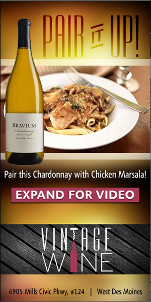
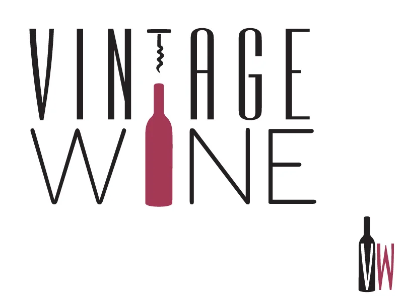
This ad campaign was proposed to Vintage Wine in West Des Moines. It was created with the GIADC Creative Campaign team by me, Krista Kent and led by Brian Tallman. We developed multiple logo concepts and presented 2 options.
Here are some of the logo icon options I created during Startup Weekend Spencer. You can see the final brand in my original post http://rileyb.me/blog/2013/6/18/push-loyalty
Introducing the first place winner of Startup Weekend Spencer, Push Loyalty. RXA Technology invited me to join their team for another Startup Weekend. We worked all weekend on this idea and got version 1 designed and built. I worked on the brand and graphics for the presentation. I also worked closely with the developers to create a color scheme and app icons.
Sign up at PushLoyalty.co and check out our big story on Silicon Prairie News.







Last weekend I helped create a startup called SpotVendr at Startup Weekend Ames. It was a great competition and we ended up getting 3rd place. I only slept 10 hours all weekend. I also made some new friends on my team. You can see us below. I created the logo and animation that our team used in our presentation. Now that the weekend is over our team has continued on with the project. Please check out the website and sign up to be notified when our product is ready.
Check out the animation with audio at http://rileyb.me/blog/2013/4/17/spotvendr
This is my redesign of the Kings of BBQ logo for 2013. I was the designer last year and they decided to do it annually every September. I designed the site as well. Check it out and let me know what you think. mallbbq.com
This year my biggest project was Tipsy Tees. Amy Chapin stumbled across my site last year and came to me with her business idea. First off, I made a logo. It took awhile to get the right font. We went through a lot of different versions and eventually came to this.
She had loads of shirt ideas, so I started drawing. We got to about 30 shirts and then it was time to order the transfers and shirts. She did all the printing in her home and built up her inventory a little.
Meanwhile, I started to design the website. She chose Big Cartel as the store management system and I started with the theme she chose. It took a couple months to get everything figured out, but we got there.
Here is one of my favorite illustrations from the holiday site update.
I hope you enjoyed the breakdown. Please go check out the site to see all of our shirt designs.
Kings of BBQ was an event this year that I did all of the graphics for. It was put on by Chris Brennick of Rockstar Satellite (one of my main clients).
Check out more event photos at Picture Iowa.


