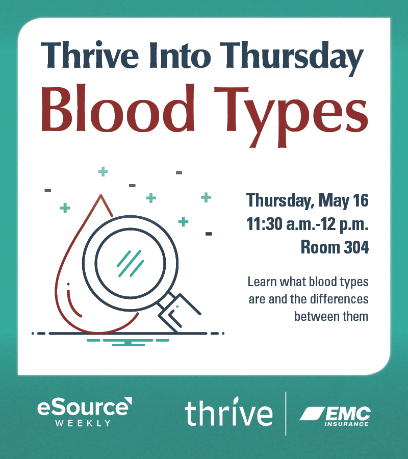
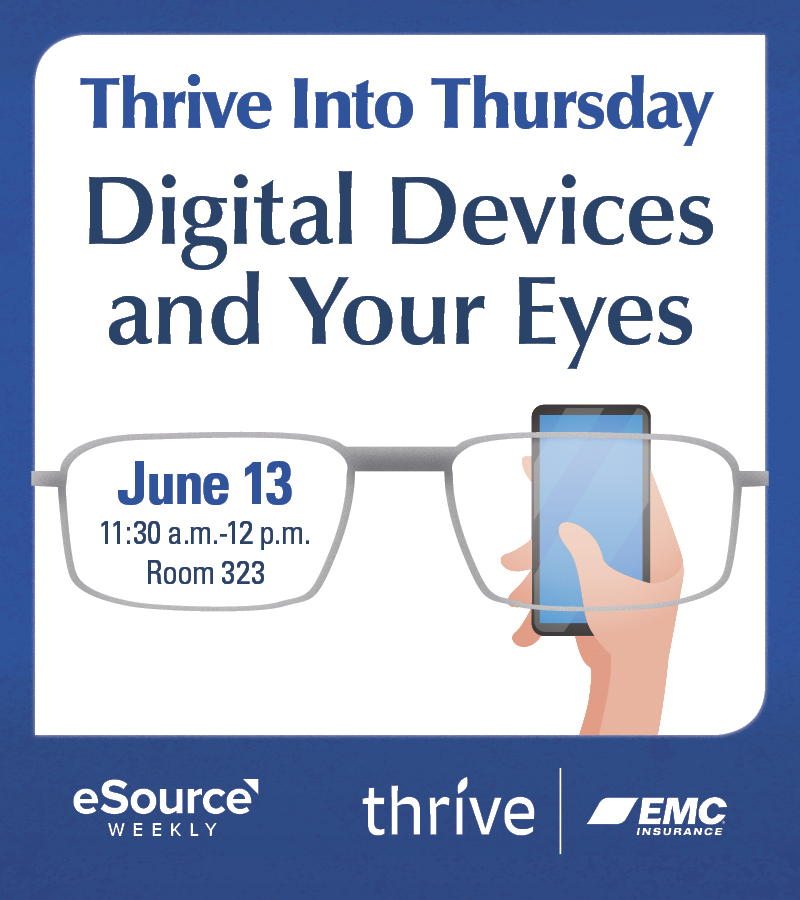
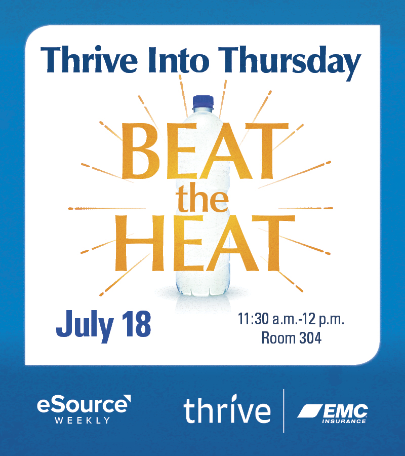
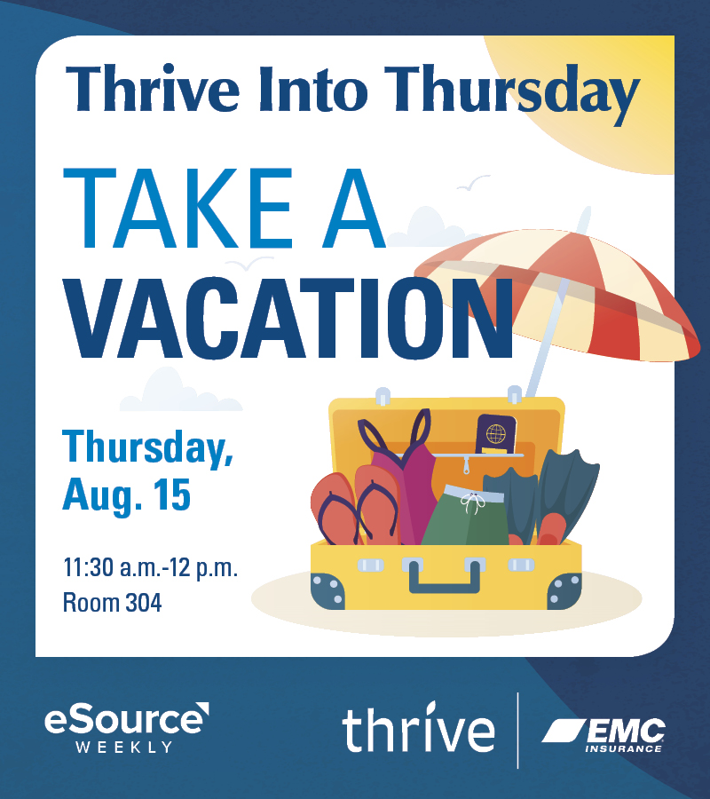
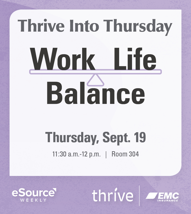
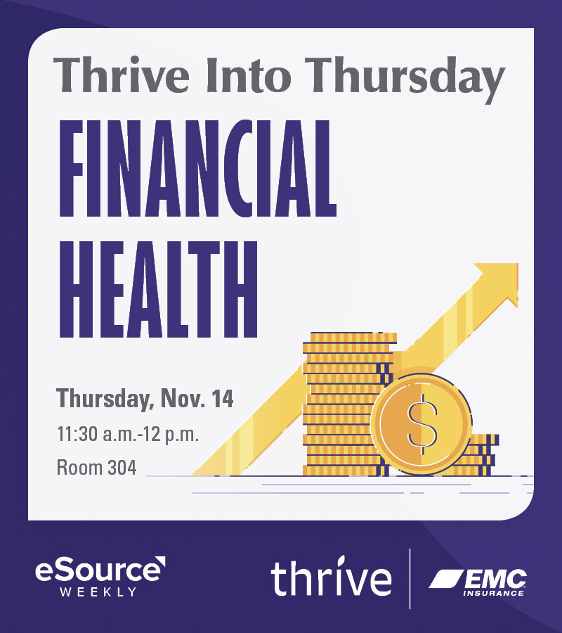
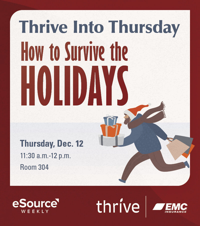
These are part of a series of seminars for the Thrive program at EMC Insurance. I’ll add more when they are ready.
The creations of Riley James Briggs. A Des Moines area designer and photographer. If you need a logo or a website check out my portfolio and request a quote.
Viewing entries in
graphic design
I designed and animated this logo and animation for my friend, Jake’s youtube channel. Check it out to see his short movie reviews.
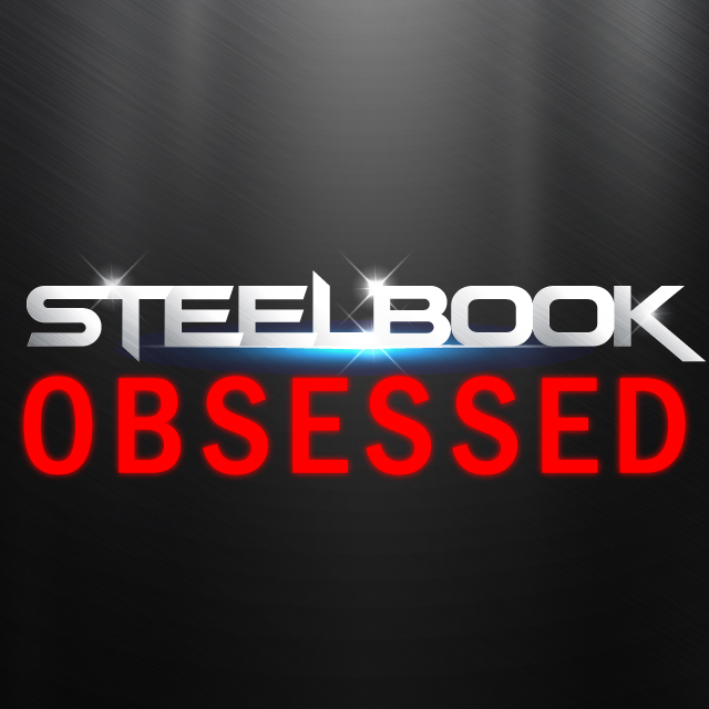
Logo for Jake’s Instagram page with his Steelbook collection and movie reviews.
I made this logo for my friends who have been making this gaming and movie review podcast. I updated their logotype and added some icons that animate for the video intro. This is the non-8-bit version.

Click the button and subscribe to them!
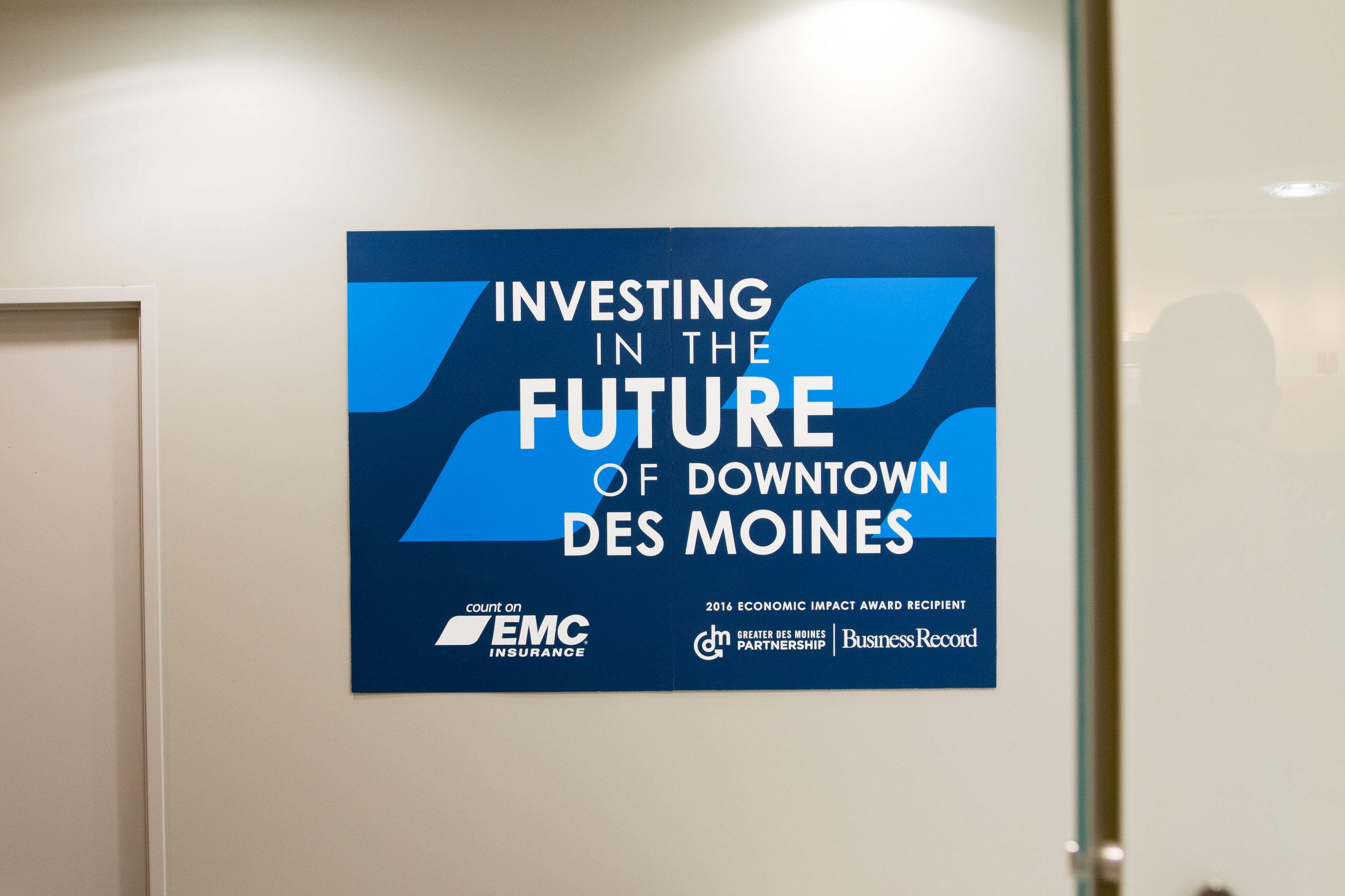
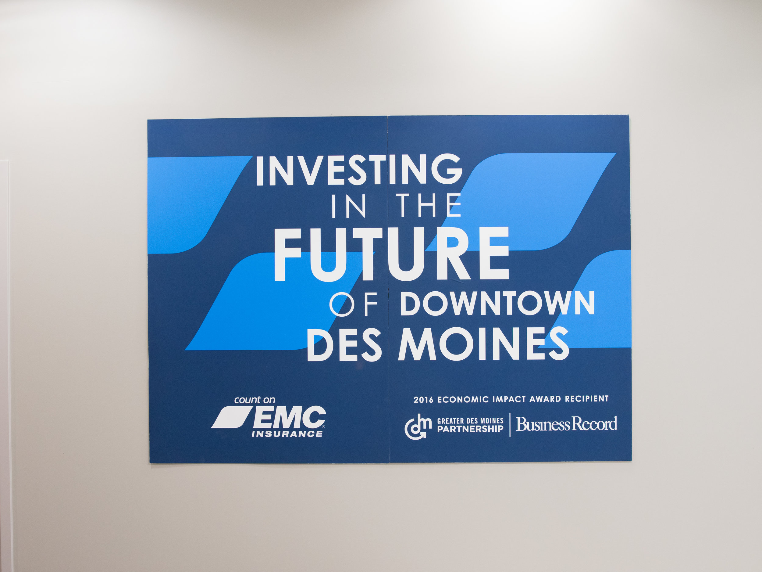
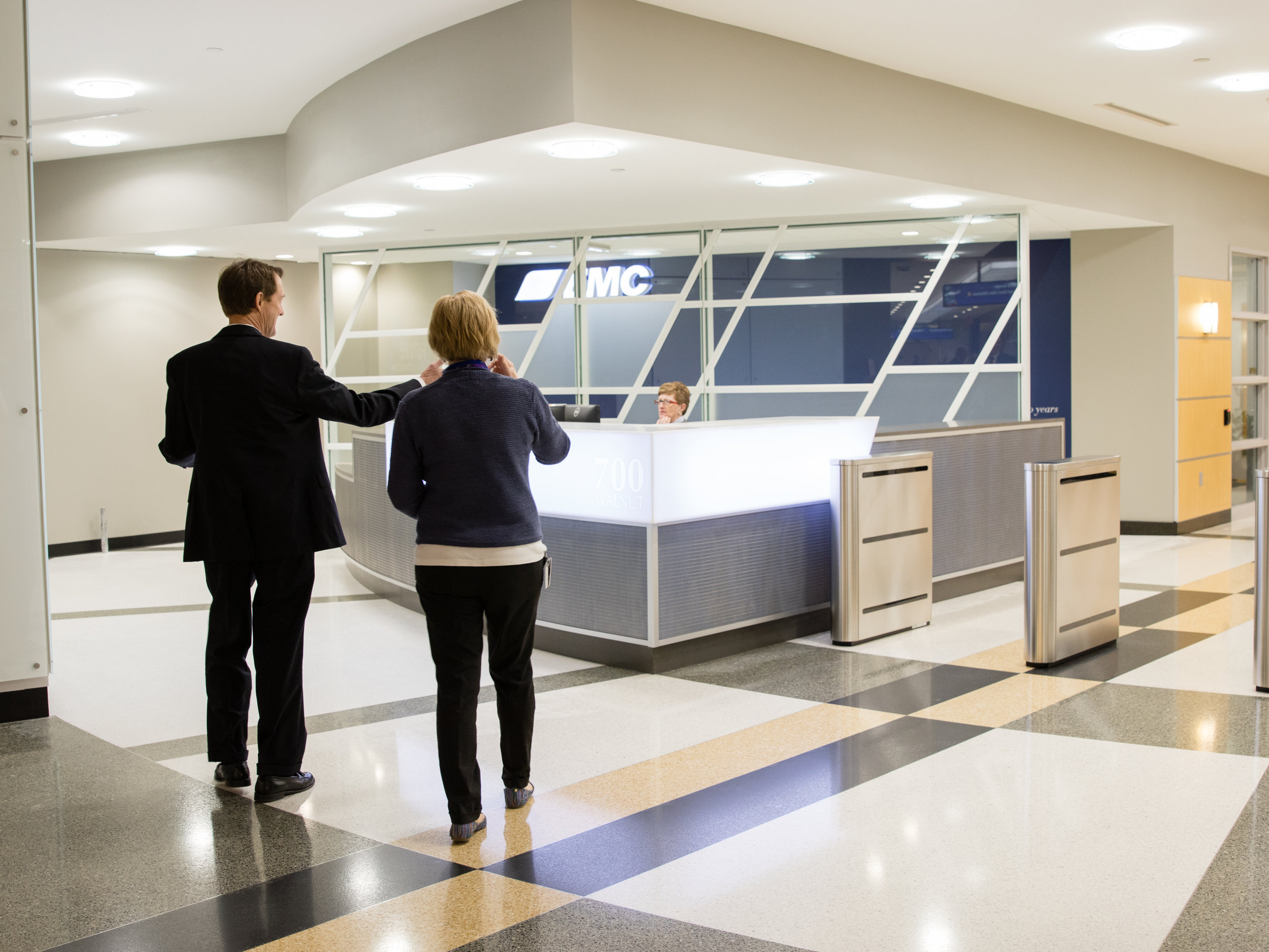
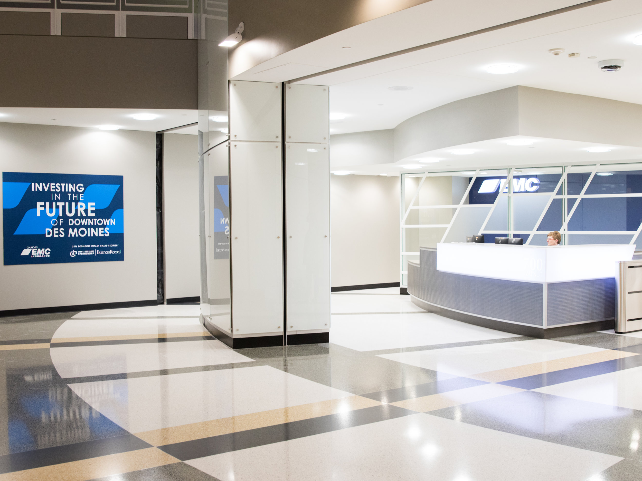
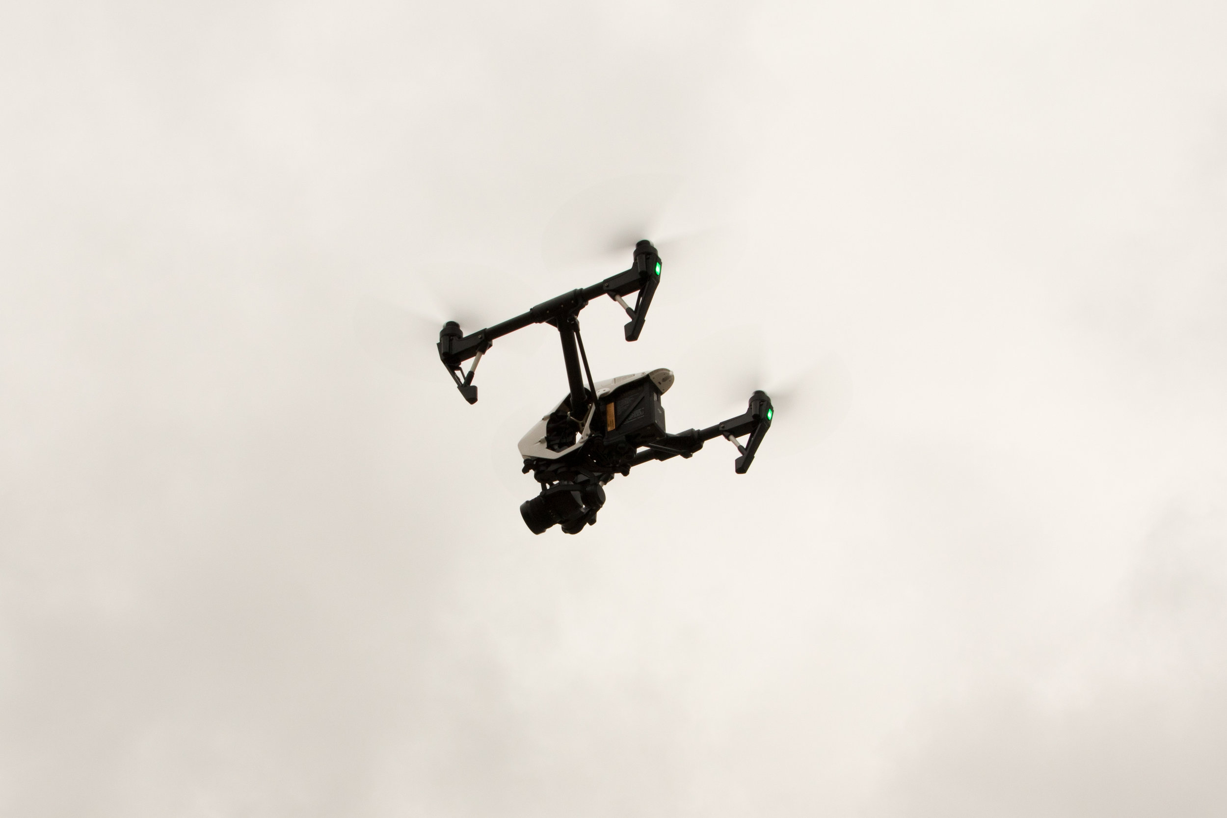
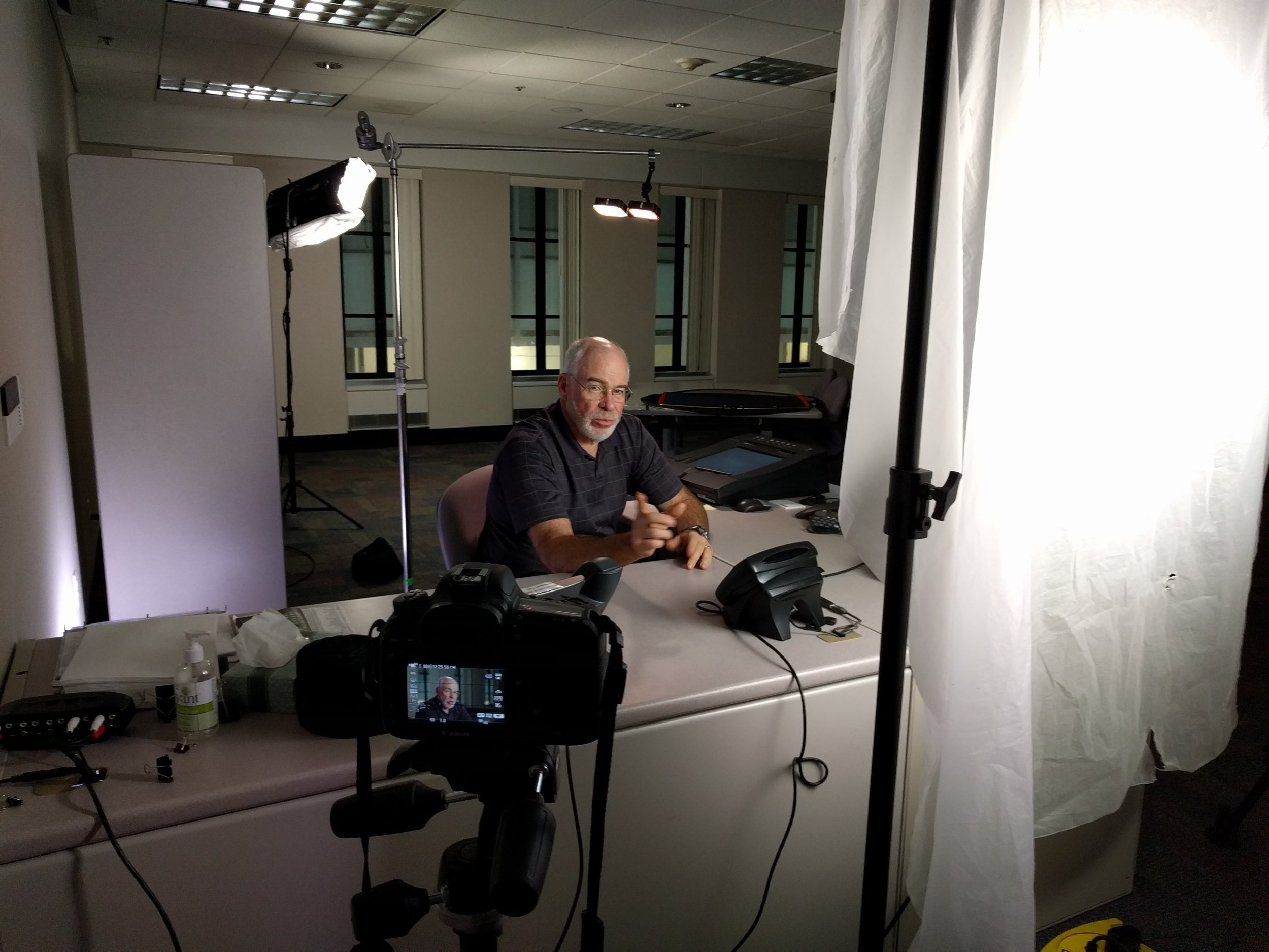
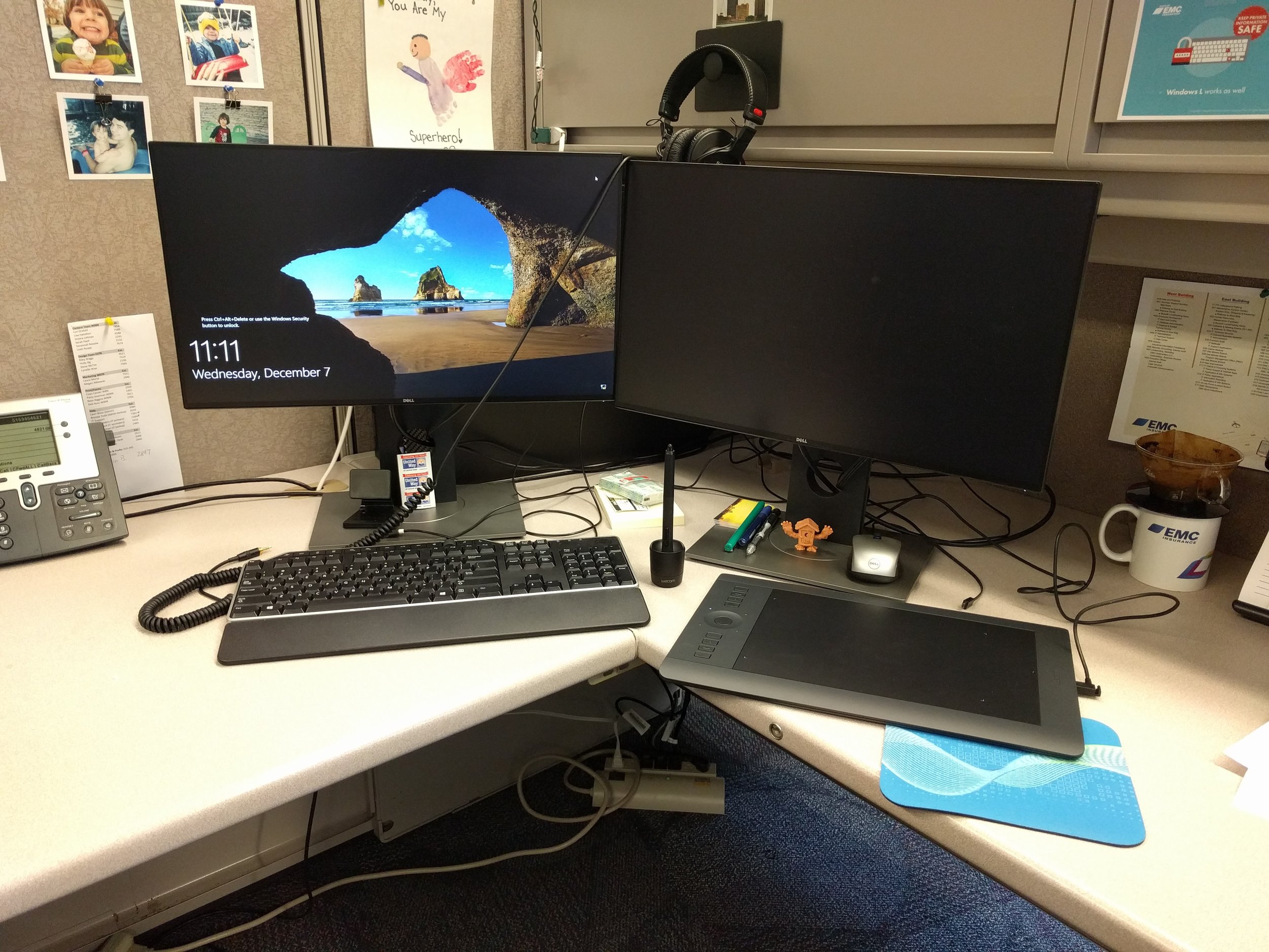
Here some some examples of my projects at my new job with EMC Insurance. I have had a variety of work to do like posters, brochures, web graphics and animated videos. I worked on a video shoot for a commercial and made some animated pieces to use for the internal video. So far it's been exciting and I am pretty proud of what I have accomplished and learned so far.
A past client came to me with a logo design job for a new project he is doing legal work for.
Secured Futures is an endeavor created by Bill Berg, a financial planner. He has a special needs child and he is now specializing in special needs financial planning.
Their web developer sent me this concept to start with.
I started with the concept and tried to work in a family as well as the Iowa flag in the icon.
early draft of my logo design
I refined the curves of the illustration and dropped the Iowa flag theme to make it friendlier to match the website design.
Final logo design
The client loved it. I will update this post with the site design and a link once it goes live.
Update: Their developer finished the website. Check it out at securedfuturesia.com
This is a campaign that I worked on with the GIADC Creative Campaign team. The creative was developed by me and Hayley Peterson and led by Brian Tallman. I designed the digital/animated ads and Hayley designed the print ads. I also designed the logo because the client didn't have a consistent one. I based it off the look of their building and used neon letters because the locals know them by their neon sign.
This is a campaign that I worked on with the GIADC Creative Campaign team. The creative was developed by me and Christine Thompson and led by Brian Tallman. I designed the digital/animated ads and Christine designed the print ads.
This is a campaign that I worked on with the GIADC Creative Campaign team. The creative was developed by me and Krista Kent and led by Brian Tallman. I created the animated ads and Krista made the print ads.
This is a campaign that I worked on with the GIADC Creative Campaign team. The creative was developed by me and Jon Kytola and led by Brian Tallman. I created the animated ads and Jon made the print ads. We took some of their existing branding elements and made it more iconic and eye-catching.
This ad campaign was originally proposed for Jethro's BBQ N' BACON BACON's grand opening but that was delayed and we ended up reusing the art for an April Fool's joke. It was created with the GIADC Creative Campaign team by me, Hayley Anderson and led by Brian Tallman. I designed the animated digital ads in Adobe Flash and animated HTML5 ads in Adobe Edge. I also illustrated the new front facing Jethro character.
This is a campaign that I worked on with the GIADC Creative Campaign team. The creative was developed by me and Kris Ahrens and led by Brian Tallman. I created the animated ads above and Kris made the print ads below. We had a lot of fun with making the color palette and writing some punny copy.
This is a campaign that I worked on with the GIADC Creative Campaign team. The creative was developed by me and Hayley Anderson and led by Brian Tallman. I created the animated ads and Hayley made the print ads. View the HTML5 pushdown ad here.
This is a campaign that I worked on with the GIADC Creative Campaign team. The creative was developed by me and Ben Patin and led by Brian Tallman. I designed the digital/animated ads and Ben designed the print ads. I also designed the logo.
For a recent campaign at work I designed a logo for an Open House Weekend that will be used on print, digital, landing page, HTML5 ads, and an email blast. Me and my partner Katie were inspired by some design styles from the Portland, Oregon area that this is for. We used some evergreen trees, birds, woodgrain and some unique filters on the photography. Check out the animated ad at the link below!
my logo design for Mid-Valley Open House Weekend
Pushdown HTML5 design
This is a campaign that I worked on with the GIADC Creative Campaign team. The creative was developed by me and Jolene Schultz and led by Brian Tallman. I designed the digital/animated ads and Jolene designed the print ads. We handmade the logo based off of different fonts and illustrated the fair characters.
Animated HTML5 Pushdown ad
http://www.htrnews.com/?usatai=7070&usatan=preview&usatl=giadcp-vNFhiC
Mobile transition ad
300x600 Flash ad
160x600 Flash ad
This is a campaign that I worked on with the GIADC Creative Campaign team. The creative was developed by me and Christine Thompson and led by Brian Tallman. I designed the digital/animated ads and Christine designed the print ads.
I just listened to an episode of 99 PERCENT INVISIBLE about flag design and I wanted to take a stab at it. I took a few minutes and made this flag for my city, Altoona, Iowa.
Altoona, Iowa flag design
North American Vexillological Association principles of flag design
1. Keep it simple
2. Use meaningful symbolism
3. Use two to three basic colors
4. No lettering or seals of any kind.
5. Be distinctive
I tried to follow these principles however I don't have time to research so I am not sure how distinctive it is. Blue and green have already been used in Altoona's branding, but I chose some more exciting hues. The blue in mine somewhat represents the river to the west of us that runs through Des Moines. The green can also represent the farmland in the area. The middle triangle can be a capital A for Altoona and an arrow pointing positively to the future.
This is a campaign that I worked on with the GIADC Creative Campaign team. The creative was developed by me and Katie Dondale and led by Brian Tallman. I created the animated ads and Katie made the print ads. I had some fun recreating the style of the Ford tv commercials. View the interactive ad at this link.
I designed this turkey for my son Ryker. Illustrated with Adobe Illustrator and edited in Snapseed.
Some photos from my family's Thanksgiving.