This is a logo I designed for fun. I was trying to create a logo for a sushi restaurant in Des Moines, Iowa. Originally it was DSM instead of DOOM. DSM is the abbreviation of Des Moines. Then I came up with this better idea with the 2 sushi rolls.
Viewing entries in
graphic design
I created this logo for Chris with Rockstar Satellite. He hosts a couple radio shows at his DIRECTV ZONE store at Merle Hay Mall and this logo was created for one of the possible shows. It hasn't been used yet, but I wanted to share it anyways. The only thing I would improve on now would be the eyeball/baseball. The idea behind this is based on the name Ump's Eye View. The eyeball represents the ump's eye looking across the baseball diamond. I think either of the two color options can work. Let me know what you think in the comments.
UPDATE: I have been perfecting my standing desk after first making it 2 years ago. I had to condense it to fit in the corner of my baby's room. I have recently added a 27 inch Dell monitor to my workflow. It has to sit at an angle now, but it works and has increased my productivity as a graphic designer. I definitely recommend it. Just try it and if you get tired you can use a barstool occasionally. I will update again when I get a separate office. Let me know if you have any questions.
Introducing the first place winner of Startup Weekend Spencer, Push Loyalty. RXA Technology invited me to join their team for another Startup Weekend. We worked all weekend on this idea and got version 1 designed and built. I worked on the brand and graphics for the presentation. I also worked closely with the developers to create a color scheme and app icons.
Sign up at PushLoyalty.co and check out our big story on Silicon Prairie News.


Today is me and my wife's 2nd anniversary, so I made this design from one of our wedding photos. I made a similar thing last year, but never posted it on here. Wedding photos by Laura at lifeartphotographs.com
In early March I began playing Ingress. It is an augmented reality game on Android devices that uses your gps location. I have been getting a little obsessed and got involved with the google+ community for my team in the game. I created the logo below for the group and they really liked it. The eye symbol on the right is the logo for the Enlightened team created by NianticLabs@Google.

Last weekend I helped create a startup called SpotVendr at Startup Weekend Ames. It was a great competition and we ended up getting 3rd place. I only slept 10 hours all weekend. I also made some new friends on my team. You can see us below. I created the logo and animation that our team used in our presentation. Now that the weekend is over our team has continued on with the project. Please check out the website and sign up to be notified when our product is ready.
Check out the animation with audio at http://rileyb.me/blog/2013/4/17/spotvendr
Check out my friend's youtube channel! I am working on their logo and intro to the show. Maybe then they will have me on as a guest?
This is my redesign of the Kings of BBQ logo for 2013. I was the designer last year and they decided to do it annually every September. I designed the site as well. Check it out and let me know what you think. mallbbq.com
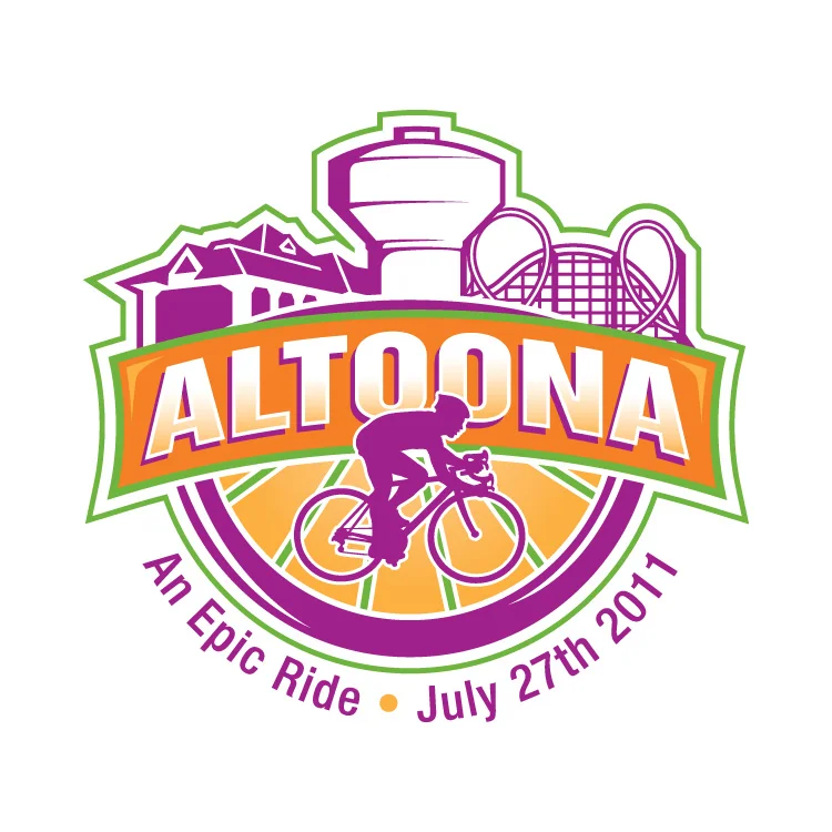
In 2011 RAGBRAI stopped through my hometown, Altoona, Iowa. City Council ran a contest for the logo design so I made this.
I didn't win as you can see in the gallery above, but I wanted to post this so I could critique myself. The contest rules stated that we use the four spot colors chosen by the council and that the slogan is "An Epic Ride". I honestly didn't spend much time designing this. The bike is from the DOT's Bike Crossing sign used by the government. The colors were chosen already. I didn't add them til the end, as a background. I thought about the meaning of Altoona, which comes from the word altitude, because Altoona is supposedly the highest point in Iowa. So that idea put the "mountain" behind the bike. The bike is supposed to be going across Iowa with Altoona as the highest and middlest part of the RAGBRAI race. If I were to change anything now that I have 2 more years of experience, it would be the font. I still like the style, but I think it would've been more epic if everything was a little more jagged, as if I cut everything out of construction paper. It also might help if the weight of the stroke on the bike wheels equaled the thickness of the ALTOONA font. The white box shape would've been cool to use in other applications such as name tags, signs and maps for the riders.
Let me know what you think.
This year my biggest project was Tipsy Tees. Amy Chapin stumbled across my site last year and came to me with her business idea. First off, I made a logo. It took awhile to get the right font. We went through a lot of different versions and eventually came to this.
She had loads of shirt ideas, so I started drawing. We got to about 30 shirts and then it was time to order the transfers and shirts. She did all the printing in her home and built up her inventory a little.
Meanwhile, I started to design the website. She chose Big Cartel as the store management system and I started with the theme she chose. It took a couple months to get everything figured out, but we got there.
Here is one of my favorite illustrations from the holiday site update.
I hope you enjoyed the breakdown. Please go check out the site to see all of our shirt designs.
Kings of BBQ was an event this year that I did all of the graphics for. It was put on by Chris Brennick of Rockstar Satellite (one of my main clients).
Check out more event photos at Picture Iowa.
Mr. Tully came to me early this year wanting a logo. He just started practicing law on his own and this is what he wanted. Mr. Tully made this himself to give me an idea as to what he wanted in a logo.
“The logo looks AWESOME... having a lot of compliments so far!”
Thomas P. Tully
Attorney and Counselor at Law
Des Moines & Polk City, IA.
515-556-4692
Tom@TullyLawOfficePC.com
a mockup of an ad I created for Salem Health
http://digitalcreative.gannett.com/sandbox/salemhealth/
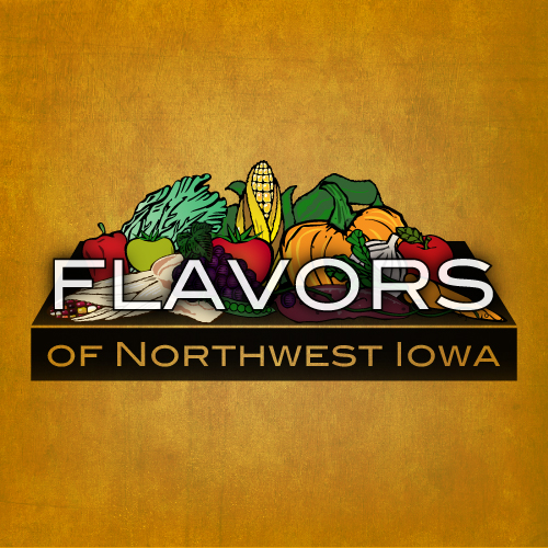
 This is a logo I created at the beginning of 2011. Flavors of Northwest Iowa is a regional network for local food producers and consumers. I had many concepts and will show them below, but here is the final version that their committee chose.
This was one of the first concepts and my favorite. I loved the colors and the idea of the table loaded with local food.
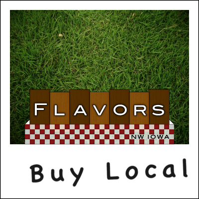
I must have wanted the logo to be a table, because here is another concept, this time it is a birds-eye view of a picnic table. The actual logo wouldn't have the grass or the polaroid frame, that was just a cool way to use it, I think.
There were a couple more concepts, but they are not worthy.
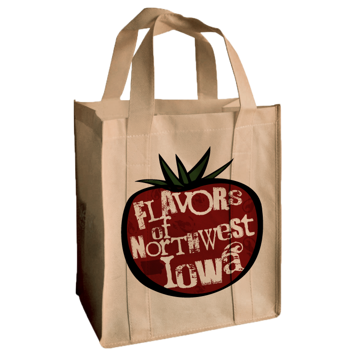
I also gave the client some real world uses for the logo, like a reusable bag that could be sold at farmer's markets.
Testimonials I got a couple kudos from the client afterwards.
"You are awesome!"
"Hooray! I am excited to start using it! I showed it off at a statewide local food meeting. Also, one of my co-workers was jealous that I have such an awesome logo, and she was not happy with hers. I said, “Well I guess you should have hired Riley Briggs!”
"I am definitely happy with your work. Thanks so much!"
hey! It's @rileyjbriggs ! He made our logo. Sooo good to work with that we sometimes try to think of things we might need design work for!
— Flavors (@local_flavor) November 18, 2011


