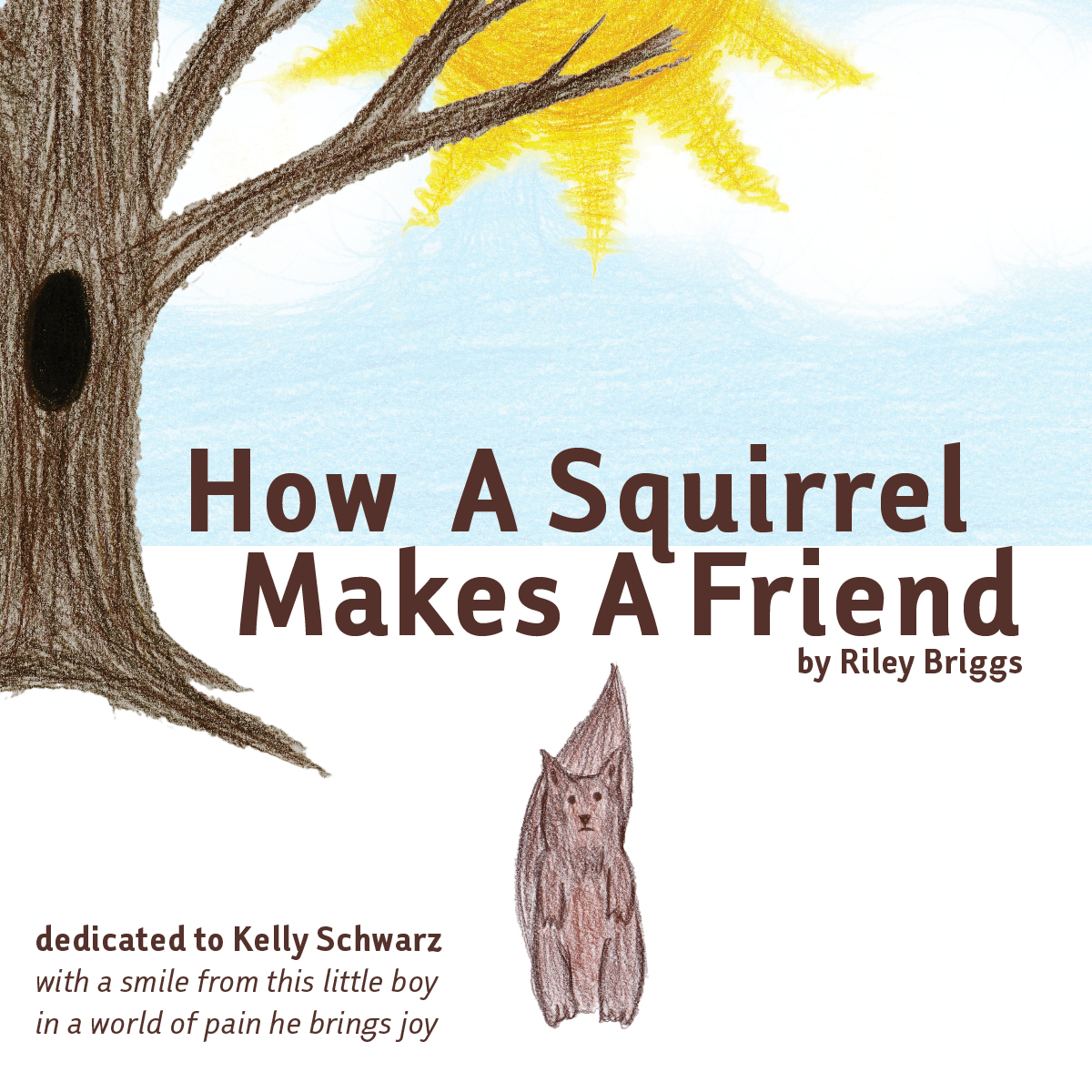
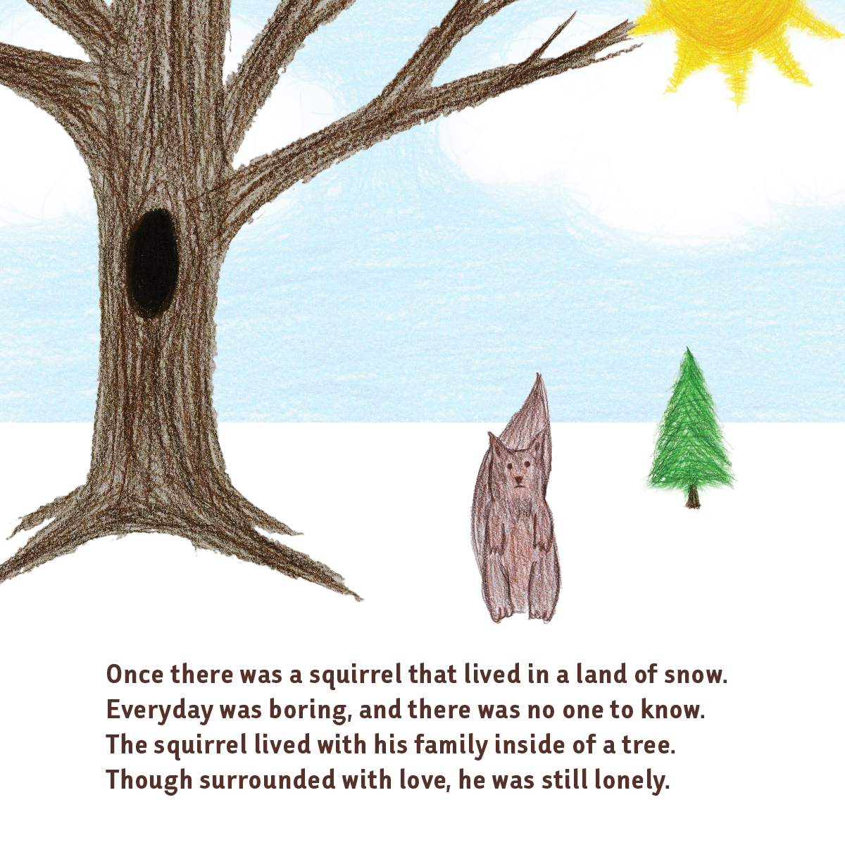
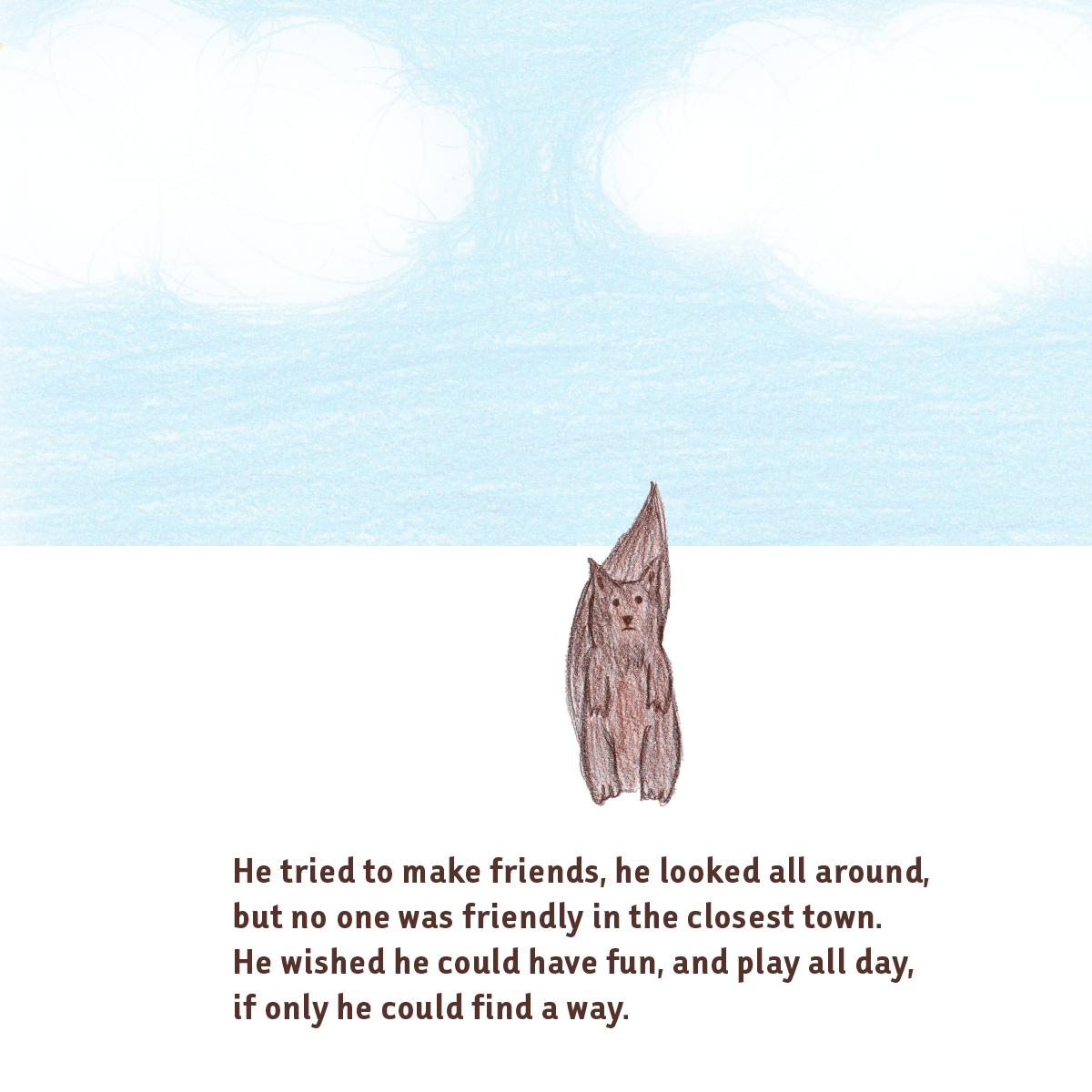
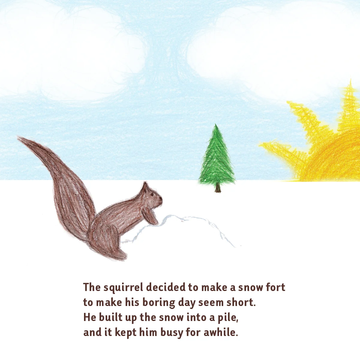
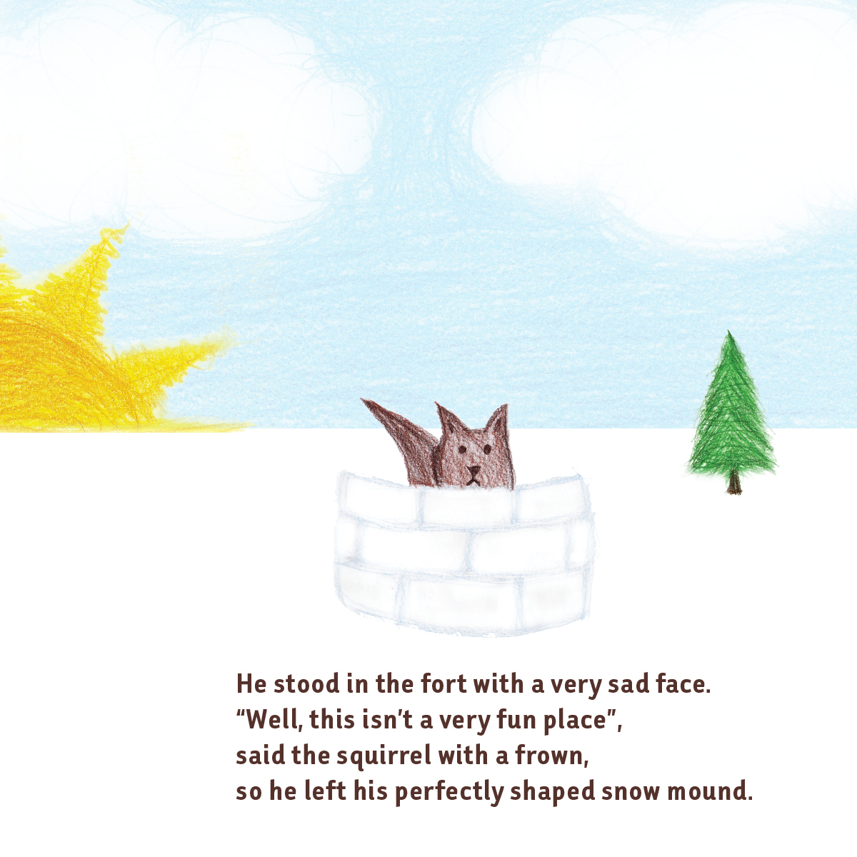
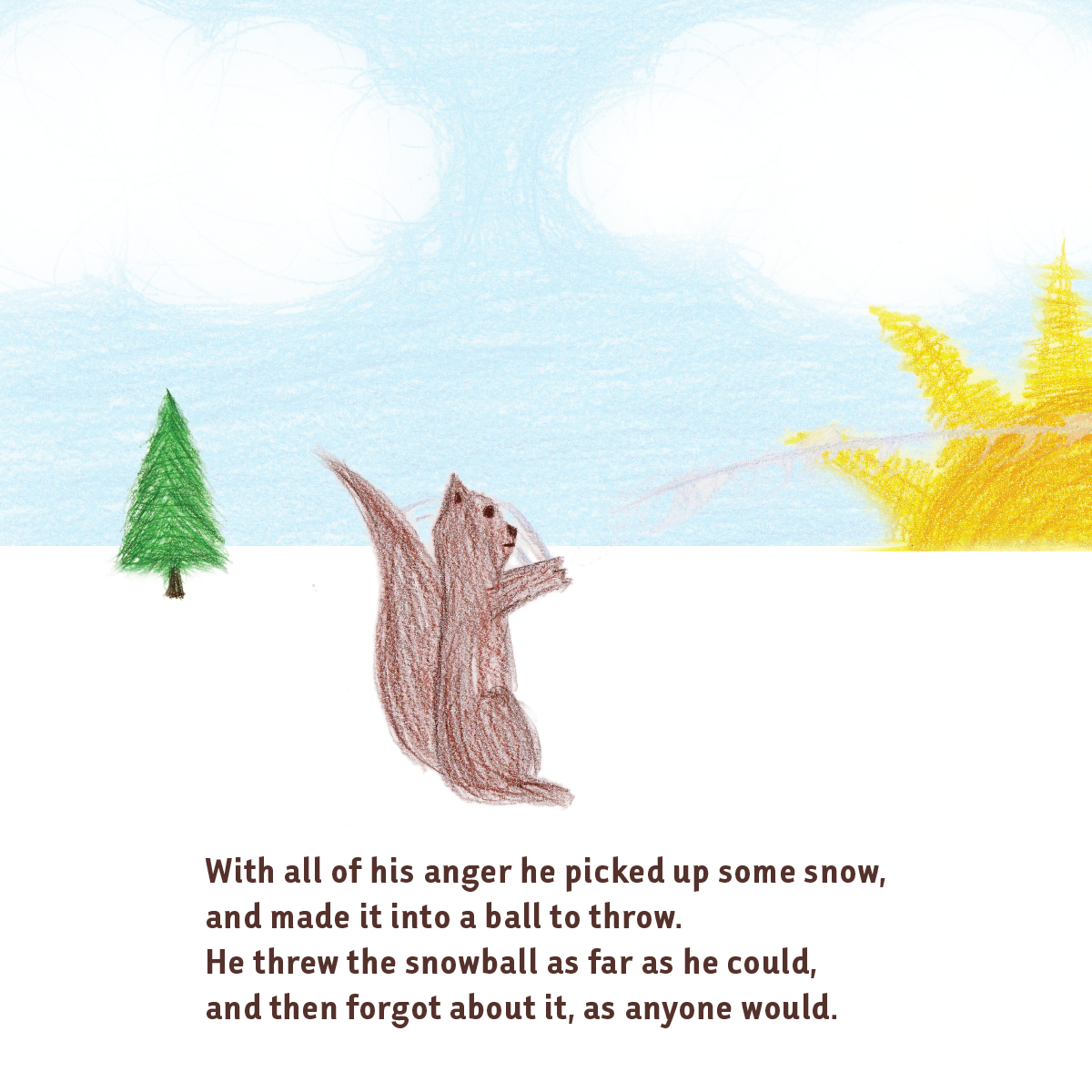
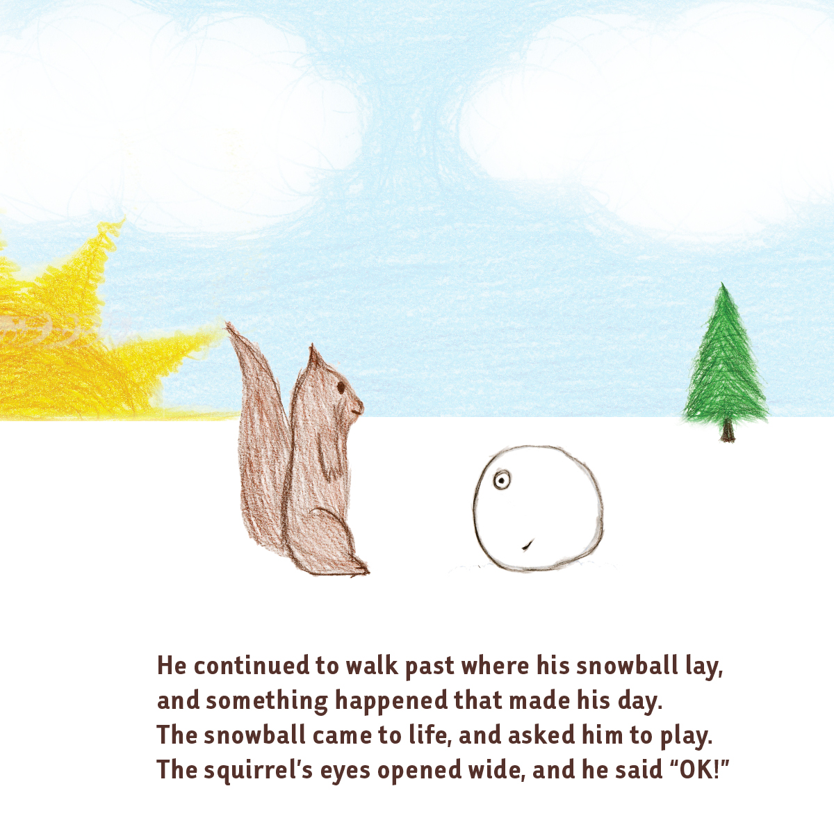
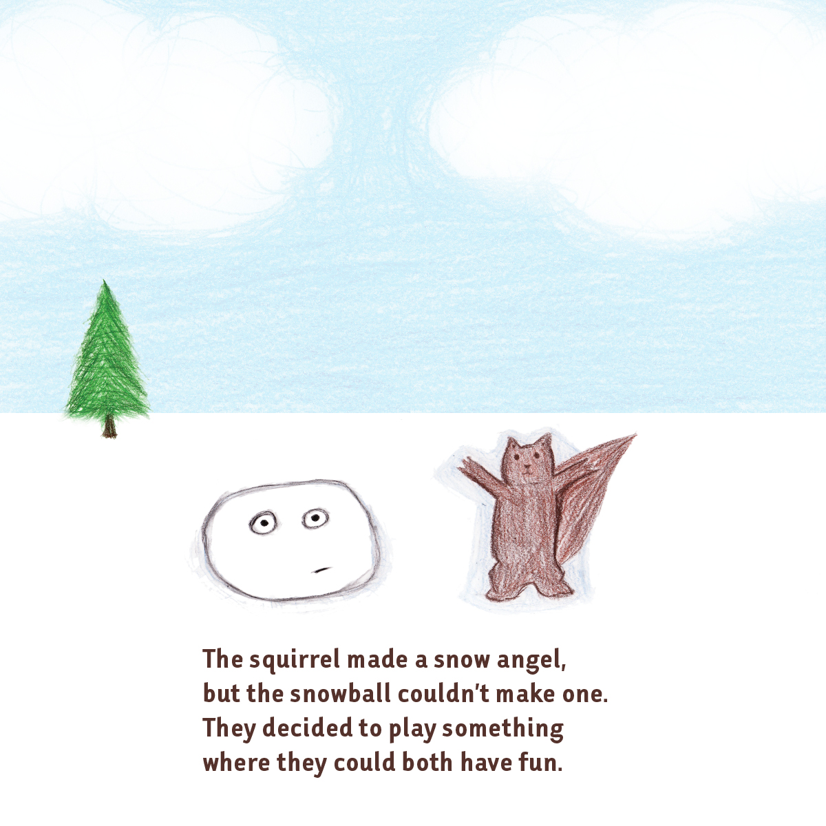
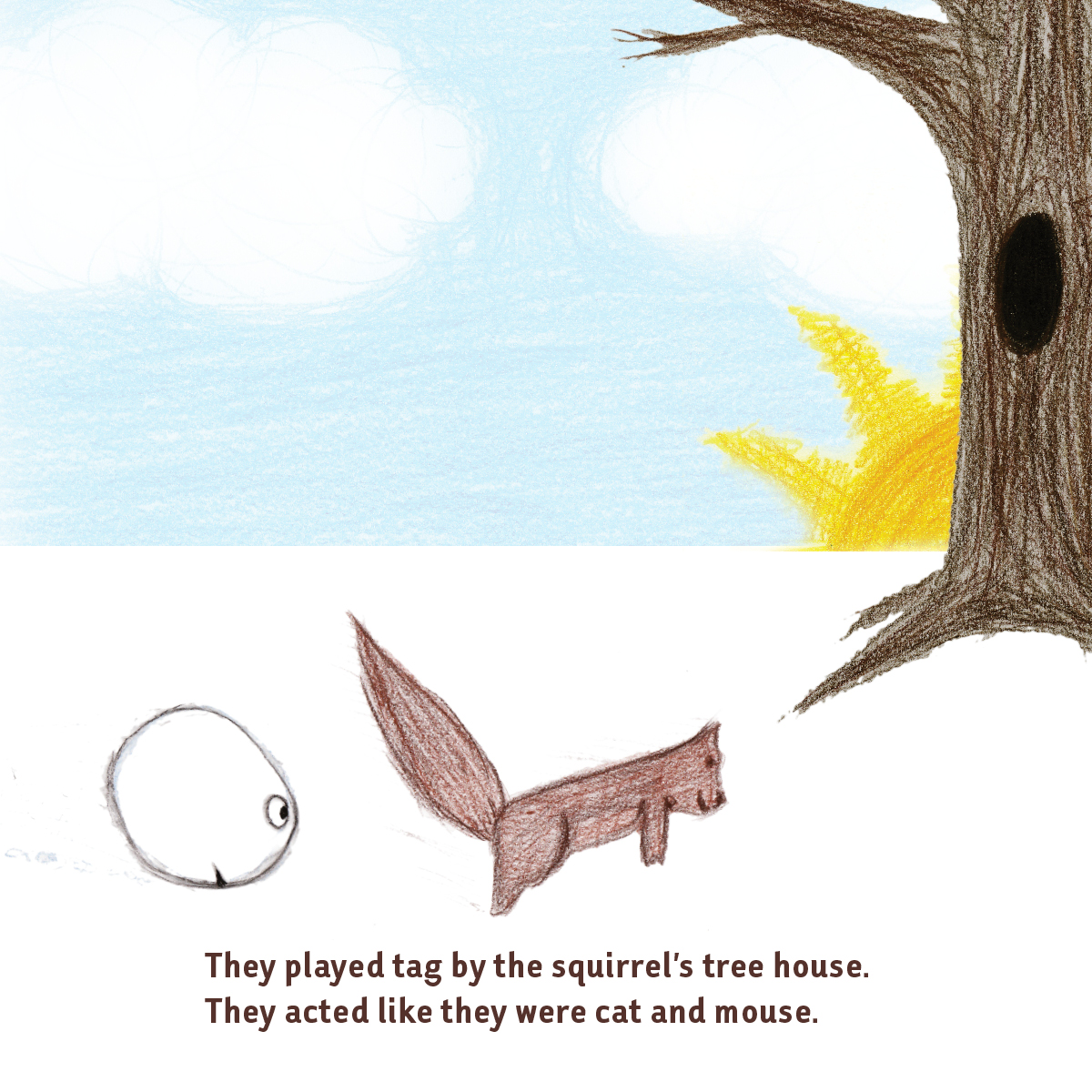
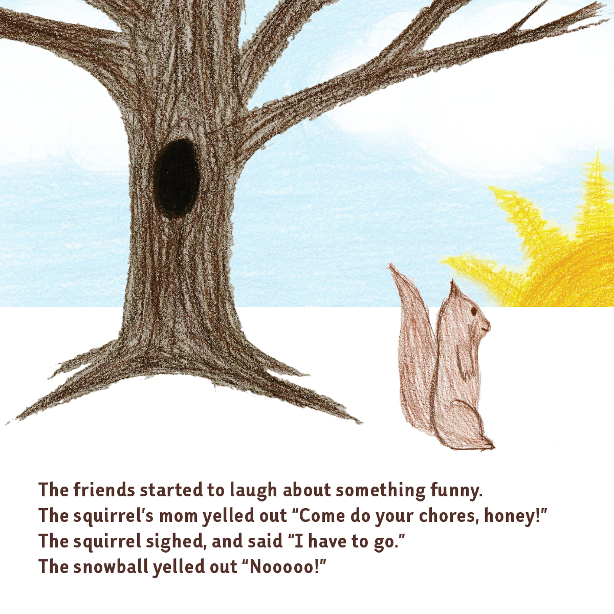
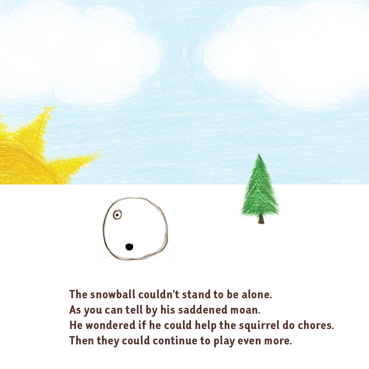
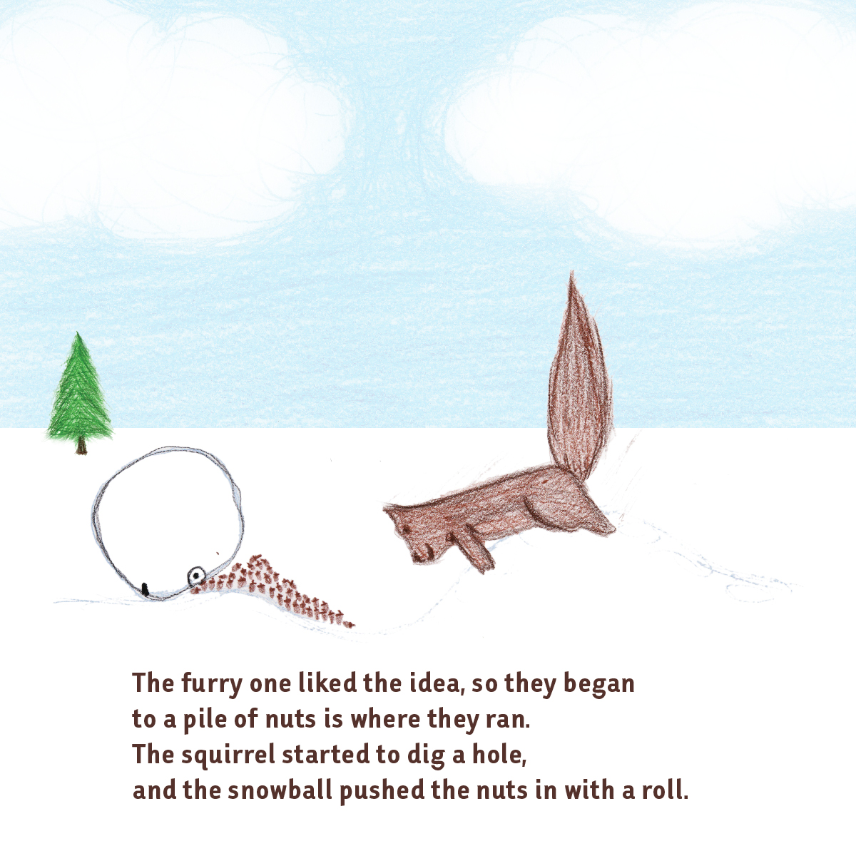
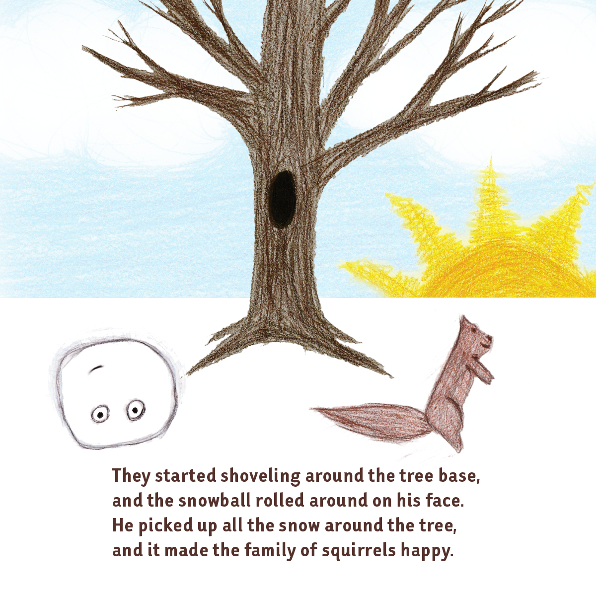
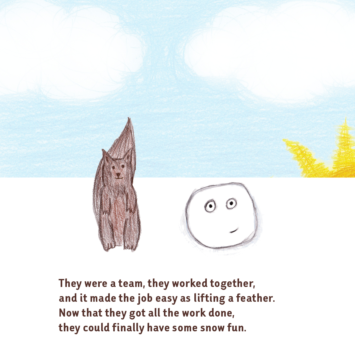
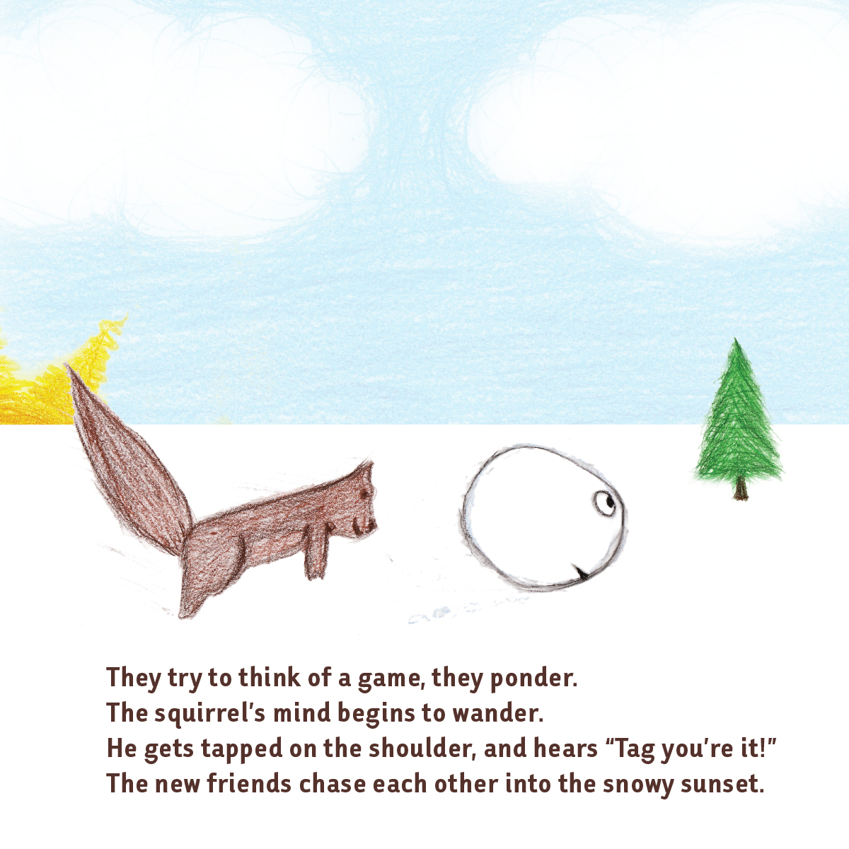
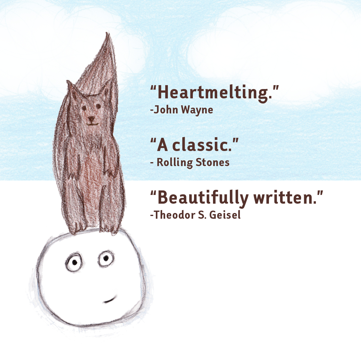
This is a book I made in high school for a creative writing class. Originally it was made by cutting out colored construction paper, but I decided to re-draw it a couple years ago for my cousin Kelly.
The creations of Riley James Briggs. A Des Moines area designer and photographer. If you need a logo or a website check out my portfolio and request a quote.
Viewing entries in
illustration
This year my biggest project was Tipsy Tees. Amy Chapin stumbled across my site last year and came to me with her business idea. First off, I made a logo. It took awhile to get the right font. We went through a lot of different versions and eventually came to this.
She had loads of shirt ideas, so I started drawing. We got to about 30 shirts and then it was time to order the transfers and shirts. She did all the printing in her home and built up her inventory a little.
Meanwhile, I started to design the website. She chose Big Cartel as the store management system and I started with the theme she chose. It took a couple months to get everything figured out, but we got there.
The holiday version of the site.
Tipsy Santa
Here is one of my favorite illustrations from the holiday site update.
I hope you enjoyed the breakdown. Please go check out the site to see all of our shirt designs.
the storefront
Welcome Cooks
Kings of BBQ shirt
Facebook Banner
Drinks Signage
Rockstar Satellite Vinyl Vehicle Wrap
Kings of BBQ was an event this year that I did all of the graphics for. It was put on by Chris Brennick of Rockstar Satellite (one of my main clients).
Check out more event photos at Picture Iowa.
Kings of BBQ poster design
Prize Raffle
Music by Richard Arndt
Water Bottle Packaging
 This is a logo I created at the beginning of 2011. Flavors of Northwest Iowa is a regional network for local food producers and consumers. I had many concepts and will show them below, but here is the final version that their committee chose.
This was one of the first concepts and my favorite. I loved the colors and the idea of the table loaded with local food.
I must have wanted the logo to be a table, because here is another concept, this time it is a birds-eye view of a picnic table. The actual logo wouldn't have the grass or the polaroid frame, that was just a cool way to use it, I think.
There were a couple more concepts, but they are not worthy.
I also gave the client some real world uses for the logo, like a reusable bag that could be sold at farmer's markets.
Testimonials I got a couple kudos from the client afterwards.
"You are awesome!"
"Hooray! I am excited to start using it! I showed it off at a statewide local food meeting. Also, one of my co-workers was jealous that I have such an awesome logo, and she was not happy with hers. I said, “Well I guess you should have hired Riley Briggs!”
"I am definitely happy with your work. Thanks so much!"
hey! It's @rileyjbriggs ! He made our logo. Sooo good to work with that we sometimes try to think of things we might need design work for!
— Flavors (@local_flavor) November 18, 2011
I designed the back of this seasons Iowa Barnstormers schedules.
They have a link to a flash animation I did. CLICK HERE to check it out.
Barnstormers Schedule
Iowa Barnstormers Background