Viewing entries in
Typography
In May of this year I signed up for Design Assign. I heard about it through a work email at the GIADC.
“Design Assign is a collaborative partnership that gives back to the greater Des Moines area community through design. Alongside AIGA Iowa, area creatives will use their talents to provide local non-profit organizations with communications products that can help raise awareness and funds.”
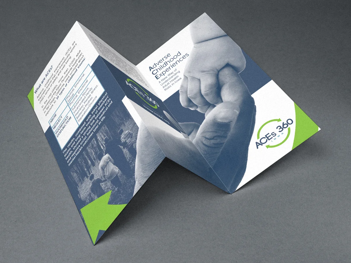
In June, I got paired with Prevent Child Abuse Iowa to design a brochure/flier.
Since 1975, Prevent Child Abuse Iowa has led child abuse prevention efforts in Iowa through advocacy, awareness and assistance. PCA Iowa is the only statewide organization dedicated to preventing child abuse and the only consistent voice for child abuse prevention during the state legislative session. The organization manages state and federal grant programs, which contribute financial support to community groups that provide services to families.
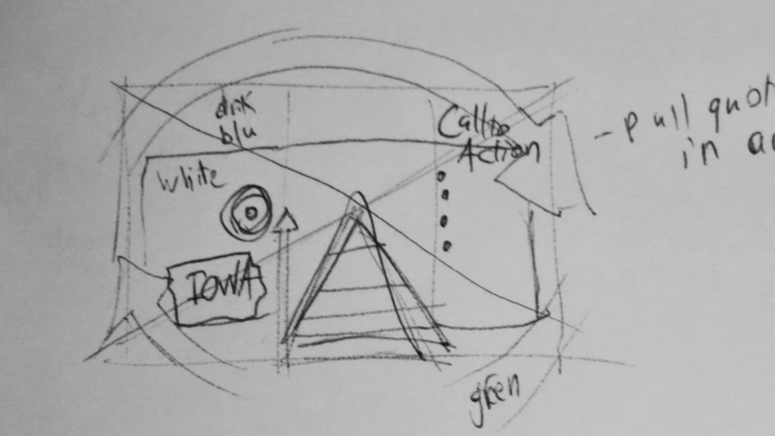
I met with Sarah from PCA Iowa and we went over the information that needed to be in the brochure. I then organized all that information and sketched a layout.
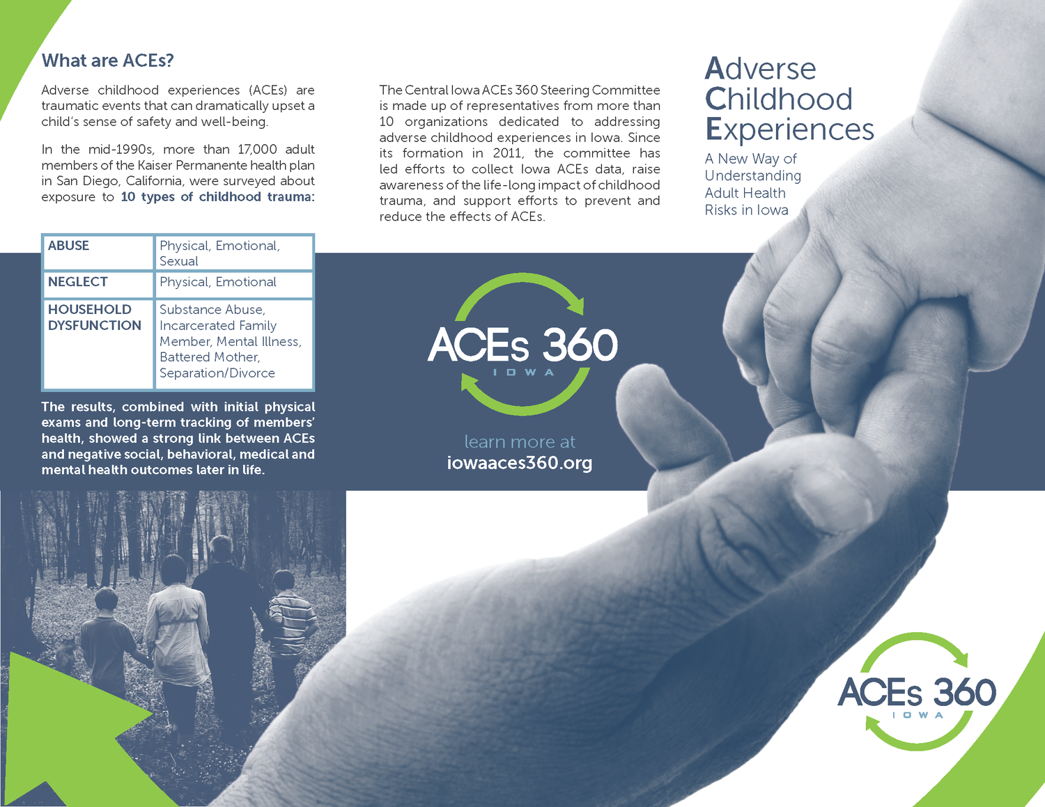
The goal was to develop a communications toolkit for community groups and organizations to use in sharing an important study on the correlation between adverse childhood experiences and adult well being. I designed a professional look for the toolkit, as well as an enticing and easy-to-digest brochure on the subject.
“We love the end result and are already using it, including at a recent conference with more than 700 attendees!”
“Riley helped us turn our vision for an easy-to-read brochure about The Adverse Childhood Experiences Study into something far more engaging than we ever imagined. Beyond his technical graphic design skills, he offers many talents in working on collaborative marketing projects including generating ideas, seeking and incorporating feedback, and coming up with solutions to difficult tasks. We appreciate the creativity and energy he brought to this project and hope to work with him again on future projects.”
I am presenting this at the Design Assign 3rd Annual Culmination Gala on October 23rd at 6 along with the other volunteers and their non-profits.
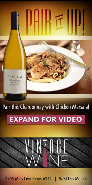
This ad campaign was proposed to Vintage Wine in West Des Moines. It was created with the GIADC Creative Campaign team by me, Krista Kent and led by Brian Tallman. We developed multiple logo concepts and presented 2 options.
I created this logo for Chris with Rockstar Satellite. He hosts a couple radio shows at his DIRECTV ZONE store at Merle Hay Mall and this logo was created for one of the possible shows. It hasn't been used yet, but I wanted to share it anyways. The only thing I would improve on now would be the eyeball/baseball. The idea behind this is based on the name Ump's Eye View. The eyeball represents the ump's eye looking across the baseball diamond. I think either of the two color options can work. Let me know what you think in the comments.
This is my redesign of the Kings of BBQ logo for 2013. I was the designer last year and they decided to do it annually every September. I designed the site as well. Check it out and let me know what you think. mallbbq.com
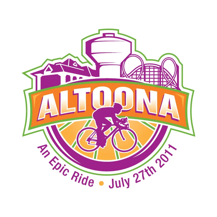
In 2011 RAGBRAI stopped through my hometown, Altoona, Iowa. City Council ran a contest for the logo design so I made this.
I didn't win as you can see in the gallery above, but I wanted to post this so I could critique myself. The contest rules stated that we use the four spot colors chosen by the council and that the slogan is "An Epic Ride". I honestly didn't spend much time designing this. The bike is from the DOT's Bike Crossing sign used by the government. The colors were chosen already. I didn't add them til the end, as a background. I thought about the meaning of Altoona, which comes from the word altitude, because Altoona is supposedly the highest point in Iowa. So that idea put the "mountain" behind the bike. The bike is supposed to be going across Iowa with Altoona as the highest and middlest part of the RAGBRAI race. If I were to change anything now that I have 2 more years of experience, it would be the font. I still like the style, but I think it would've been more epic if everything was a little more jagged, as if I cut everything out of construction paper. It also might help if the weight of the stroke on the bike wheels equaled the thickness of the ALTOONA font. The white box shape would've been cool to use in other applications such as name tags, signs and maps for the riders.
Let me know what you think.
This year my biggest project was Tipsy Tees. Amy Chapin stumbled across my site last year and came to me with her business idea. First off, I made a logo. It took awhile to get the right font. We went through a lot of different versions and eventually came to this.
She had loads of shirt ideas, so I started drawing. We got to about 30 shirts and then it was time to order the transfers and shirts. She did all the printing in her home and built up her inventory a little.
Meanwhile, I started to design the website. She chose Big Cartel as the store management system and I started with the theme she chose. It took a couple months to get everything figured out, but we got there.
Here is one of my favorite illustrations from the holiday site update.
I hope you enjoyed the breakdown. Please go check out the site to see all of our shirt designs.
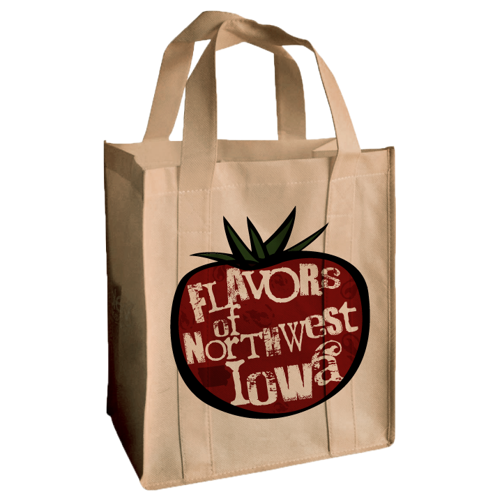
 This is a logo I created at the beginning of 2011. Flavors of Northwest Iowa is a regional network for local food producers and consumers. I had many concepts and will show them below, but here is the final version that their committee chose.
This was one of the first concepts and my favorite. I loved the colors and the idea of the table loaded with local food.
I must have wanted the logo to be a table, because here is another concept, this time it is a birds-eye view of a picnic table. The actual logo wouldn't have the grass or the polaroid frame, that was just a cool way to use it, I think.
There were a couple more concepts, but they are not worthy.
I also gave the client some real world uses for the logo, like a reusable bag that could be sold at farmer's markets.
Testimonials I got a couple kudos from the client afterwards.
"You are awesome!"
"Hooray! I am excited to start using it! I showed it off at a statewide local food meeting. Also, one of my co-workers was jealous that I have such an awesome logo, and she was not happy with hers. I said, “Well I guess you should have hired Riley Briggs!”
"I am definitely happy with your work. Thanks so much!"
hey! It's @rileyjbriggs ! He made our logo. Sooo good to work with that we sometimes try to think of things we might need design work for!
— Flavors (@local_flavor) November 18, 2011


