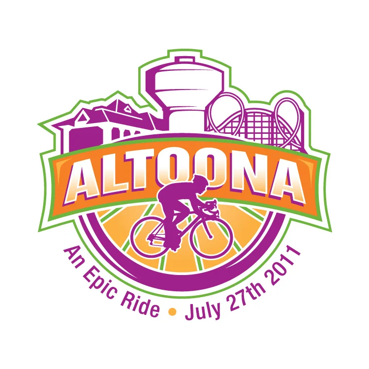
In 2011 RAGBRAI stopped through my hometown, Altoona, Iowa. City Council ran a contest for the logo design so I made this.
I didn't win as you can see in the gallery above, but I wanted to post this so I could critique myself. The contest rules stated that we use the four spot colors chosen by the council and that the slogan is "An Epic Ride". I honestly didn't spend much time designing this. The bike is from the DOT's Bike Crossing sign used by the government. The colors were chosen already. I didn't add them til the end, as a background. I thought about the meaning of Altoona, which comes from the word altitude, because Altoona is supposedly the highest point in Iowa. So that idea put the "mountain" behind the bike. The bike is supposed to be going across Iowa with Altoona as the highest and middlest part of the RAGBRAI race. If I were to change anything now that I have 2 more years of experience, it would be the font. I still like the style, but I think it would've been more epic if everything was a little more jagged, as if I cut everything out of construction paper. It also might help if the weight of the stroke on the bike wheels equaled the thickness of the ALTOONA font. The white box shape would've been cool to use in other applications such as name tags, signs and maps for the riders.
Let me know what you think.


