Flag Design
I just listened to an episode of 99 PERCENT INVISIBLE about flag design and I wanted to take a stab at it. I took a few minutes and made this flag for my city, Altoona, Iowa.
North American Vexillological Association principles of flag design
1. Keep it simple
2. Use meaningful symbolism
3. Use two to three basic colors
4. No lettering or seals of any kind.
5. Be distinctive
I tried to follow these principles however I don't have time to research so I am not sure how distinctive it is. Blue and green have already been used in Altoona's branding, but I chose some more exciting hues. The blue in mine somewhat represents the river to the west of us that runs through Des Moines. The green can also represent the farmland in the area. The middle triangle can be a capital A for Altoona and an arrow pointing positively to the future.
My new hood...
This is the view in front of my house. It looks right down a beautiful side street. I hope to take this same photo for many years to come as the seasons change.
Stormy
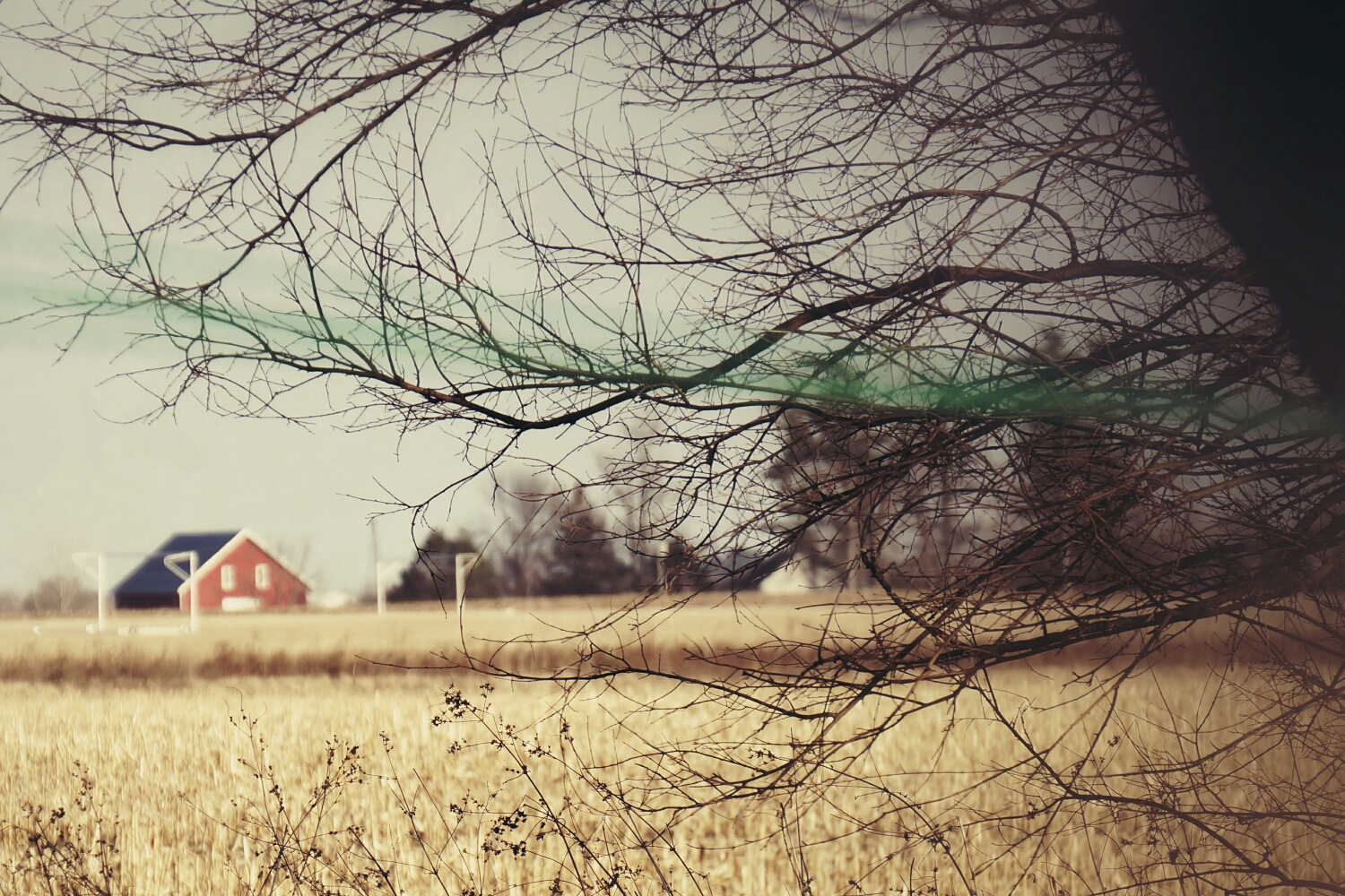
Country
Altoona - An Epic Ride
In 2011 RAGBRAI stopped through my hometown, Altoona, Iowa. City Council ran a contest for the logo design so I made this.
I didn't win as you can see in the gallery above, but I wanted to post this so I could critique myself. The contest rules stated that we use the four spot colors chosen by the council and that the slogan is "An Epic Ride". I honestly didn't spend much time designing this. The bike is from the DOT's Bike Crossing sign used by the government. The colors were chosen already. I didn't add them til the end, as a background. I thought about the meaning of Altoona, which comes from the word altitude, because Altoona is supposedly the highest point in Iowa. So that idea put the "mountain" behind the bike. The bike is supposed to be going across Iowa with Altoona as the highest and middlest part of the RAGBRAI race. If I were to change anything now that I have 2 more years of experience, it would be the font. I still like the style, but I think it would've been more epic if everything was a little more jagged, as if I cut everything out of construction paper. It also might help if the weight of the stroke on the bike wheels equaled the thickness of the ALTOONA font. The white box shape would've been cool to use in other applications such as name tags, signs and maps for the riders.
Let me know what you think.


