I designed and animated this logo and animation for my friend, Jake’s youtube channel. Check it out to see his short movie reviews.
Logo for Jake’s Instagram page with his Steelbook collection and movie reviews.
I designed and animated this logo and animation for my friend, Jake’s youtube channel. Check it out to see his short movie reviews.
Logo for Jake’s Instagram page with his Steelbook collection and movie reviews.
A past client came to me with a logo design job for a new project he is doing legal work for.
Secured Futures is an endeavor created by Bill Berg, a financial planner. He has a special needs child and he is now specializing in special needs financial planning.
Their web developer sent me this concept to start with.
I started with the concept and tried to work in a family as well as the Iowa flag in the icon.
early draft of my logo design
I refined the curves of the illustration and dropped the Iowa flag theme to make it friendlier to match the website design.
Final logo design
The client loved it. I will update this post with the site design and a link once it goes live.
Update: Their developer finished the website. Check it out at securedfuturesia.com
This is a campaign that I worked on with the GIADC Creative Campaign team. The creative was developed by me and Hayley Peterson and led by Brian Tallman. I designed the digital/animated ads and Hayley designed the print ads. I also designed the logo because the client didn't have a consistent one. I based it off the look of their building and used neon letters because the locals know them by their neon sign.
This is a campaign that I worked on with the GIADC Creative Campaign team. The creative was developed by me and Ben Patin and led by Brian Tallman. I designed the digital/animated ads and Ben designed the print ads. I also designed the logo.
For a recent campaign at work I designed a logo for an Open House Weekend that will be used on print, digital, landing page, HTML5 ads, and an email blast. Me and my partner Katie were inspired by some design styles from the Portland, Oregon area that this is for. We used some evergreen trees, birds, woodgrain and some unique filters on the photography. Check out the animated ad at the link below!
my logo design for Mid-Valley Open House Weekend
Pushdown HTML5 design
When I moved earlier this year I met my new neighbors, a family from Ghana. Noble is their boy in junior high and has an interest in design and animation. He has a website nobstarverve.hol.es where he creates educational videos. Check him out and give him some support.
He asked if he could design a logo for me and I said I would love one. He came back a day later with 3 options. He really surprised me with his style and the quality of the logos. My favorite is the middle one below, so he mocked it up on a t-shirt for me.
t-shirt mockup
This ad campaign was proposed to Vintage Wine in West Des Moines. It was created with the GIADC Creative Campaign team by me, Krista Kent and led by Brian Tallman. We developed multiple logo concepts and presented 2 options.
This is a logo I designed for a startup that never made it.

For my latest Fiverr gig I did a logo for Blake Anderson with RXA Technology who just launched Basehuddle Beta. If you ever have business meetings you should check out their site and sign up for free.
“BaseHuddle empowers businesses to challenge the effectiveness of all their meetings by allowing individuals to improve meetings through rating the meeting organizer anonymously. Help managers, supervisors, and CEOs run better meetings with BaseHuddle. Sign up for BaseHuddle Beta today to get first access to this new productivity tool.”
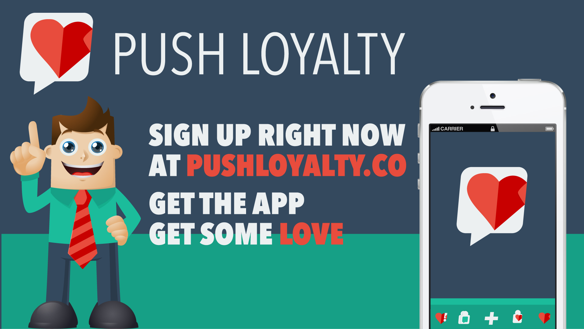
Here are some of the logo icon options I created during Startup Weekend Spencer. You can see the final brand in my original post http://rileyb.me/blog/2013/6/18/push-loyalty
I created this logo for Chris with Rockstar Satellite. He hosts a couple radio shows at his DIRECTV ZONE store at Merle Hay Mall and this logo was created for one of the possible shows. It hasn't been used yet, but I wanted to share it anyways. The only thing I would improve on now would be the eyeball/baseball. The idea behind this is based on the name Ump's Eye View. The eyeball represents the ump's eye looking across the baseball diamond. I think either of the two color options can work. Let me know what you think in the comments.
Ump's Eye View logo
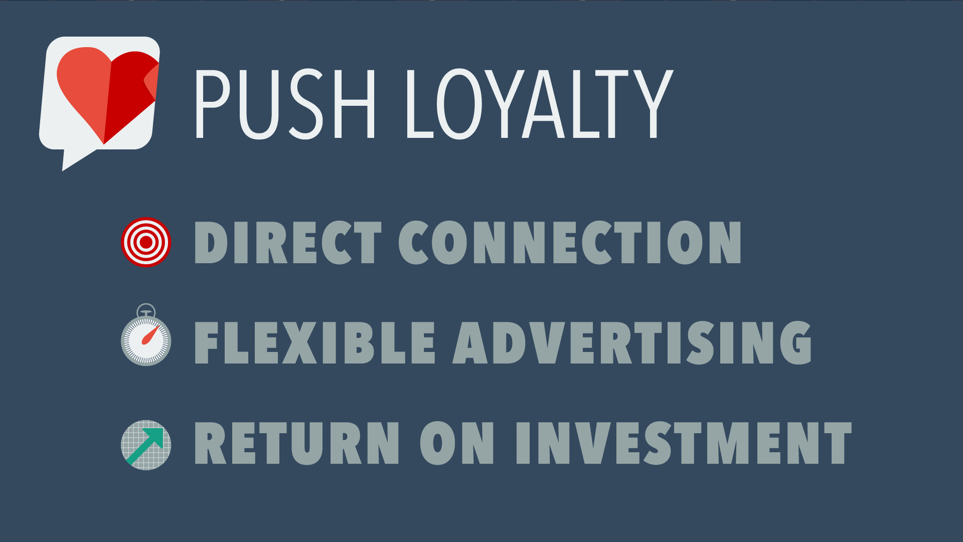
Introducing the first place winner of Startup Weekend Spencer, Push Loyalty. RXA Technology invited me to join their team for another Startup Weekend. We worked all weekend on this idea and got version 1 designed and built. I worked on the brand and graphics for the presentation. I also worked closely with the developers to create a color scheme and app icons.
Sign up at PushLoyalty.co and check out our big story on Silicon Prairie News.


I started listening to The Atheist Experience podcast almost 3 years ago. I got interested in the topic after a philosophy class in college. It helped me become more confident in outing myself as an atheist. I designed this because the logo for the podcast always looked kinda boring on my phone. So this is a rough draft. Let me know what you think in the comments.
The Atheist Experience Logo
This is my redesign of the Kings of BBQ logo for 2013. I was the designer last year and they decided to do it annually every September. I designed the site as well. Check it out and let me know what you think. mallbbq.com
Kings of BBQ logo redesign for 2013
In 2011 RAGBRAI stopped through my hometown, Altoona, Iowa. City Council ran a contest for the logo design so I made this.
I didn't win as you can see in the gallery above, but I wanted to post this so I could critique myself. The contest rules stated that we use the four spot colors chosen by the council and that the slogan is "An Epic Ride". I honestly didn't spend much time designing this. The bike is from the DOT's Bike Crossing sign used by the government. The colors were chosen already. I didn't add them til the end, as a background. I thought about the meaning of Altoona, which comes from the word altitude, because Altoona is supposedly the highest point in Iowa. So that idea put the "mountain" behind the bike. The bike is supposed to be going across Iowa with Altoona as the highest and middlest part of the RAGBRAI race. If I were to change anything now that I have 2 more years of experience, it would be the font. I still like the style, but I think it would've been more epic if everything was a little more jagged, as if I cut everything out of construction paper. It also might help if the weight of the stroke on the bike wheels equaled the thickness of the ALTOONA font. The white box shape would've been cool to use in other applications such as name tags, signs and maps for the riders.
Let me know what you think.
Mr. Tully came to me early this year wanting a logo. He just started practicing law on his own and this is what he wanted. Mr. Tully made this himself to give me an idea as to what he wanted in a logo.
“The logo looks AWESOME... having a lot of compliments so far!”
Then he wanted some unique business cards. Die cut, letterpressed, spot varnished and layered cotton paper.
Up close on the logo
Mr. Tully made this himself to give me an idea as to what he wanted in a logo.
This is a neon sign in his office.
Neon logo at night.
Thomas P. Tully
Attorney and Counselor at Law
Des Moines & Polk City, IA.
515-556-4692
Tom@TullyLawOfficePC.com
Here are some rough logo ideas I made this month. The client, Hugh's Handbuilt, is a custom motorcycle shop in the Mountains of North Carolina. They ended up choosing one similar to the bottom logo.
and they just recently gave me this shirt as a thank you gift.
 |
| From 8/22/11 |
This is a logo in the works for Pebble Beach Cottages. They have Private Lake Front Cottages on Perrault Lake in Ontario, Canada. I also might be making their website sometime. I plan on making different styles of the logo soon.
pebble beach logo