• work
  • blog
  • About
  • contact
Menu

RILEY BRIGGS: design + photography

  • work
  • blog
  • About
  • contact

Push Loyalty

June 25, 2013

Introducing the first place winner of Startup Weekend Spencer, Push Loyalty. RXA Technology invited me to join their team for another Startup Weekend. We worked all weekend on this idea and got version 1 designed and built. I worked on the brand and graphics for the presentation. I also worked closely with the developers to create a color scheme and app icons.

Sign up at PushLoyalty.co and check out our big story on Silicon Prairie News. 

Push Loyalty logo
Push Loyalty logo
Pusha
Pusha
Sign up at pushloyalty.co
Presentation slide for Startup Weekend Spencer
Facebook Banner
Facebook Banner
window stickers
window stickers
Push Loyalty logo Pusha Sign up at pushloyalty.co Presentation slide for Startup Weekend Spencer Facebook Banner window stickers
In branding, graphic design, illustration, logo, print, social, Push Loyalty, RXA Technology Tags design, logo, flat design, icon, app, illustration, branding

SpotVendr Shirts

May 28, 2013

​I got a great parking spot here.

​Ballin'

Just got one of our 3rd place prizes for Startup Weekend Ames from Sigler.

In SpotVendr, logo, branding, graphic design, apparel Tags SpotVendr, shirts, apparel

515 ENLIGHTENED

April 23, 2013

In early March I began playing Ingress. It is an augmented reality game on Android devices that uses your gps location. I have been getting a little obsessed and got involved with the google+ community for my team in the game. I created the logo below for the group and they really liked it. The eye symbol on the right is the logo for the Enlightened team created by NianticLabs@Google.

​

515 ENLIGHTENED

In graphic design, logo Tags 515, ingress, enlightened, google+, Iowa, DSM, Des Moines, Android, game, video games, mextures

SpotVendr

April 17, 2013
Convenience
Convenience

Plan your parking ahead of time and skip all the hassle of trying to find that perfect spot only minutes before your event is about to start.

Ease of Use
Ease of Use

Get paid upfront by rentrs — no need to be available for the cash transaction the day of. Remove the annoying hassle of collecting cash.

Location
Location

Choose from a selection of vendrs in multiple locations, to spot the perfect parking space to fit your budget and keep you within range of your event.

​

Choose Your Price
Choose Your Price

​Set the price that you would like or let our rentrs bid on your premium spots till their hearts content.

Security
Security

Ensure your available spots are filled by rentrs who want that premium parking spot. Feel safe knowing that you are insured and guaranteed satisfaction.

Safety
Safety

Park on credible vendr properties and ensure that you have a place to securely leave your vehicle while you are out enjoying yourself.

Convenience Ease of Use Location Choose Your Price Security Safety

Last weekend I helped create a startup called SpotVendr  at Startup Weekend Ames. It was a great competition and we ended up getting 3rd place. I only slept 10 hours all weekend. I also made some new friends on my team. You can see us below. I created the logo and animation that our team used in our presentation. Now that the weekend is over our team has continued on with the project. Please check out the website and sign up to be notified when our product is ready.


Check out the animation with audio at http://rileyb.me/blog/2013/4/17/spotvendr

​The SpotVendr team at Startup Weekend Ames


In animation, branding, graphic design, illustration, logo, video, web design, SpotVendr Tags SpotVendr, Startup Weekend, Ames, Iowa, Startup, parking, app

Stupor Video Bros.

March 28, 2013

Check out my friend's youtube channel!​ I am working on their logo and intro to the show. Maybe then they will have me on as a guest?

In graphic design, illustration, logo, video Tags Stupor Video Bros., video games, Andy Guild, Travis Lynch, beer, youtube, pixel

Kings of BBQ Facebook page

March 12, 2013
KingsOfBBQFBCover.png
In branding, graphic design, logo, social, web design Tags kings of bbq, facebook

Kings of BBQ 2013

February 13, 2013

This is my redesign of the Kings of BBQ logo for 2013. I was the designer last year and they decided to do it annually every September. I designed the site as well. Check it out and let me know what you think. mallbbq.com

Kings of BBQ logo redesign for 2013

In branding, graphic design, food, logo, Rockstar Satellite, web design, typography Tags kings of bbq, barbeque, barbecue, logo, kings, crown, star, circle logo, Des Moines, Iowa, mallbbq, merle hay mall

Altoona - An Epic Ride

January 22, 2013

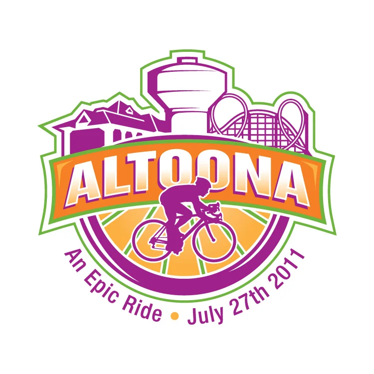
In 2011 RAGBRAI stopped through my hometown, Altoona, Iowa. City Council ran a contest for the logo design so I made this.

The logo used...
The logo used...
My logo submission...

I didn't win as you can see in the gallery above, but I wanted to post this so I could critique myself. The contest rules stated that we use the four spot colors chosen by the council and that the slogan is "An Epic Ride". I honestly didn't spend much time designing this. The bike is from the DOT's Bike Crossing sign used by the government. The colors were chosen already. I didn't add them til the end, as a background. I thought about the meaning of Altoona, which comes from the word altitude, because Altoona is supposedly the highest point in Iowa. So that idea put the "mountain" behind the bike. The bike is supposed to be going across Iowa with Altoona as the highest and middlest part of the RAGBRAI race. If I were to change anything now that I have 2 more years of experience, it would be the font. I still like the style, but I think it would've been more epic if everything was a little more jagged, as if I cut everything out of construction paper. It also might help if the weight of the stroke on the bike wheels equaled the thickness of the ALTOONA font. The white box shape would've been cool to use in other applications such as name tags, signs and maps for the riders.

Let me know what you think.

In graphic design, logo, typography Tags RAGBRAI, logo, Bike, Altoona, Bicycle, Epic Ride, Iowa, design

Tipsy Tees

December 13, 2012

This year my biggest project was Tipsy Tees. Amy Chapin stumbled across my site last year and came to me with her business idea. First off, I made a logo. It took awhile to get the right font. We went through a lot of different versions and eventually came to this.

She had loads of shirt ideas, so I started drawing. We got to about 30 shirts and then it was time to order the transfers and shirts. She did all the printing in her home and built up her inventory a little.

Meanwhile, I started to design the website. She chose Big Cartel as the store management system and I started with the theme she chose. It took a couple months to get everything figured out, but we got there.

The holiday version of the site.

Tipsy Santa

Here is one of my favorite illustrations from the holiday site update.

I hope you enjoyed the breakdown. Please go check out the site to see all of our shirt designs.

the storefront

In graphic design, logo, web design, illustration, branding, apparel, typography Tags tees, tipsy, shirts, alcohol, drink, apparel

Kings of BBQ

October 20, 2012

Welcome Cooks

Kings of BBQ shirt

Facebook Banner

Drinks Signage

Rockstar Satellite Vinyl Vehicle Wrap

Kings of BBQ was an event this year that I did all of the graphics for. It was put on by Chris Brennick of Rockstar Satellite (one of my main clients).

Check out more event photos at Picture Iowa.

Kings of BBQ poster design

Prize Raffle

Music by Richard Arndt

Water Bottle Packaging

In graphic design, logo, vinyl vehicle wrap, Rockstar Satellite, illustration, branding, signage, print, apparel

Tully Law Office, P.C.

October 14, 2012

Mr. Tully came to me early this year wanting a logo. He just started practicing law on his own and this is what he wanted. Mr. Tully made this himself to give me an idea as to what he wanted in a logo.

“The logo looks AWESOME... having a lot of compliments so far!”
— Thomas Tully

Then he wanted some unique business cards. Die cut, letterpressed, spot varnished and layered cotton paper.

Up close on the logo

Mr. Tully made this himself to give me an idea as to what he wanted in a logo.

This is a neon sign in his office.

Neon logo at night.

Thomas P. Tully
Attorney and Counselor at Law
Des Moines & Polk City, IA.
515-556-4692
Tom@TullyLawOfficePC.com

In graphic design, logo, branding, signage Tags logo, law, sign, neon

Flavors of Northwest Iowa

January 1, 2012

Flavors of Northwest Iowa (final logo) This is a logo I created at the beginning of 2011. Flavors of Northwest Iowa is a regional network for local food producers and consumers. I had many concepts and will show them below, but here is the final version that their committee chose.
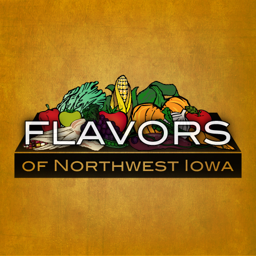
Flavors of Northwest Iowa (early concept)


This was one of the first concepts and my favorite. I loved the colors and the idea of the table loaded with local food.
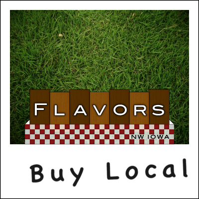
 

Flavors of Northwest Iowa (picnic table logo concept)


I must have wanted the logo to be a table, because here is another concept, this time it is a birds-eye view of a picnic table. The actual logo wouldn't have the grass or the polaroid frame, that was just a cool way to use it, I think.

There were a couple more concepts, but they are not worthy.
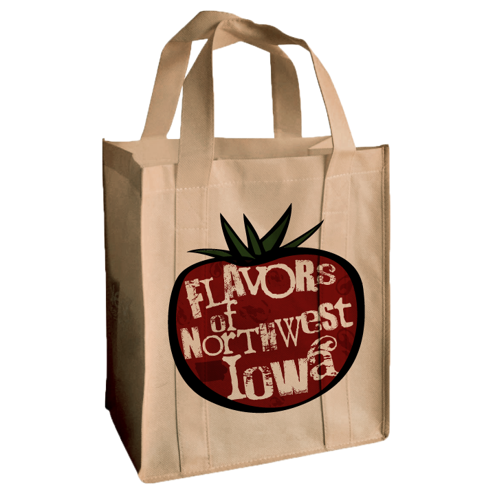
 

Flavors of Northwest Iowa Logo on a Reusable Bag


I also gave the client some real world uses for the logo, like a reusable bag that could be sold at farmer's markets.

Testimonials I got a couple kudos from the client afterwards.

"You are awesome!"

"Hooray! I am excited to start using it! I showed it off at a statewide local food meeting. Also, one of my co-workers was jealous that I have such an awesome logo, and she was not happy with hers. I said, “Well I guess you should have hired Riley Briggs!”

"I am definitely happy with your work. Thanks so much!"


hey! It's @rileyjbriggs ! He made our logo. Sooo good to work with that we sometimes try to think of things we might need design work for!

— Flavors (@local_flavor) November 18, 2011

In branding, graphic design, illustration, logo, typography

The Edge 88 gradient

The Edge 88.1 FM

September 5, 2011

The Edge 88.1

In graphic design, logo, branding, apparel

Woody's AudioVision

June 27, 2011

This was a logo/business cards I made a couple years ago for my friend, Adam Woody.

Woody's AudioVision

In branding, graphic design, logo, print Tags woody audiovision

SPARQ code

June 27, 2011

Another old logo that never got used...

Sparq Code logo

In graphic design, logo

Seismic

June 27, 2011

Another old logo that never got used...
Seismic Games

In graphic design, logo

R. G. Boston Motors

June 27, 2011

Here is a logo I did a couple years ago that I never got paid for, so I thought I would post it.

R. G. BOSTON MOTORS

In graphic design, logo Tags R. G. Boston Motors, tire, metal, texture

The Clone Wars

April 26, 2011

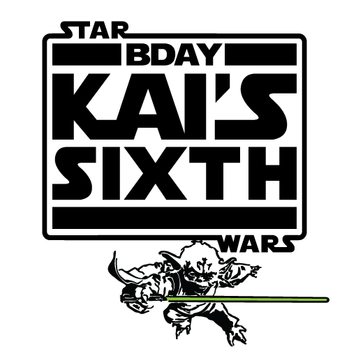
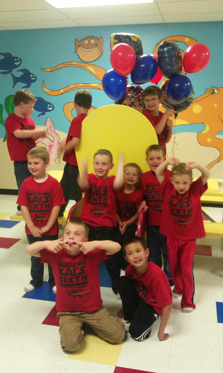
I just designed this logo for my client, Chris Brennick. It is for his son Kai's Sixth Birthday Party. He loves Star Wars so I based this off of The Clone Wars logo. Everybody gets their own shirt (I'm getting one too).

Kai's Birthday Party

In apparel, graphic design, logo, typography Tags birthday, clone wars, kai, party, shirt, star wars

Hugh's Handbuilt Logo

April 24, 2011

Here are some rough logo ideas I made this month. The client, Hugh's Handbuilt, is a custom motorcycle shop in the Mountains of North Carolina. They ended up choosing one similar to the bottom logo.


and they just recently gave me this shirt as a thank you gift.

From 8/22/11
In apparel, graphic design, logo Tags custom, graphic design, hot rod, hugh's handbuilt, logo, motorcycle

Pebble Beach

January 8, 2010

This is a logo in the works for Pebble Beach Cottages. They have Private Lake Front Cottages on Perrault Lake in Ontario, Canada. I also might be making their website sometime. I plan on making different styles of the logo soon.

pebble beach logo

In graphic design, logo Tags logo, pebble, Perrault Lake, canada, beach, Canadian flag, Ontario, x
← Newer Posts Older Posts →

Latest Posts

Featured
Steelbook Obsessed graphic and pin
EMC goes to fire school
Ryker turned 9 years old
Seattle Day Tour and Alaskan Cruise
Pepper Sparkles
Disney World
Making our family's Caga Tió
A Year of Weddings
United Way theme for EMC Insurance
Skating with Ryker
Portfolio

Powered by Squarespace